There’s a big misconception that color grading black and white projects is easier than grading in full color. While in some respects, grading in color does add an additional layer of complexity, achieving a filmic B & W look can be just as complex for different reasons.
Many filmmakers use virtually the same grading approach that they would use for color footage on their black and white projects, and more often than not wind up with less than stellar results. In fact, many of the techniques that help color footage look more organic or filmic, can actually have the opposite effect on black and white footage, making shots appear dull or video-ish.
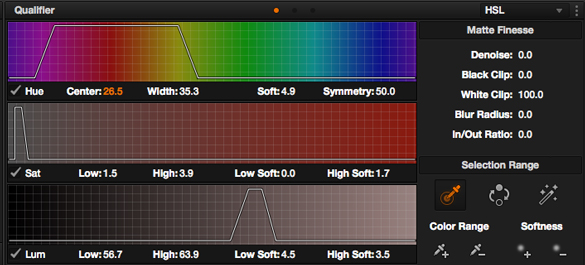
Below are a few of the biggest considerations to take into account when coloring your black and white footage.
Keep in mind that while I am using DaVinci Resolve to create these looks and demonstrate some of the techniques, you can apply these principles in virtually any basic editing software too.
CONTRAST IS YOUR FRIEND
In recent years there has been this push towards the “milky black look” on color projects. This look is achieved by lifting the black levels on shots so far that sit far above true black (or 0 IRE). The idea is that lifting your shadows will emulate the look of old film stocks, which sometimes had lower contrast qualities to them.
Personally, I don’t like when this look is overdone – for film or black and white, as it is more based in a nostalgic memory of what film used to look like, as opposed to what really good film stocks are able to reproduce. But I’ve already tackled this on a different article.
Many old black and white film stocks were actually very high contrast. In fact, many of them also didn’t have a ton of dynamic range, and as such footage from these stocks were known for crushed blacks and bright highlights, creating a very punchy expressionistic sort of feel.
With that in mind. The number one piece of advice I give when coloring black and white footage is to embrace your contrast curve.
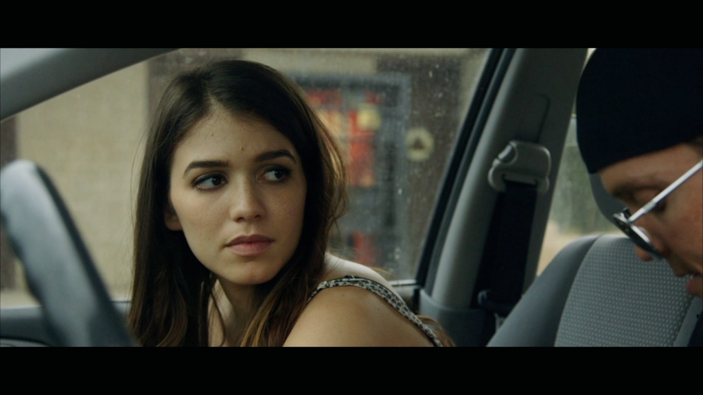
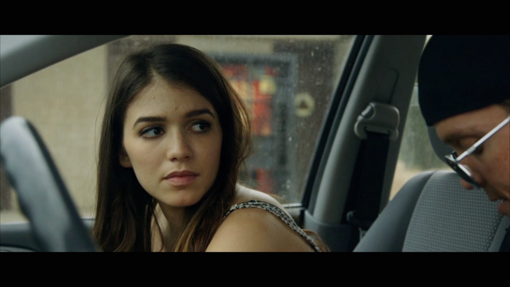
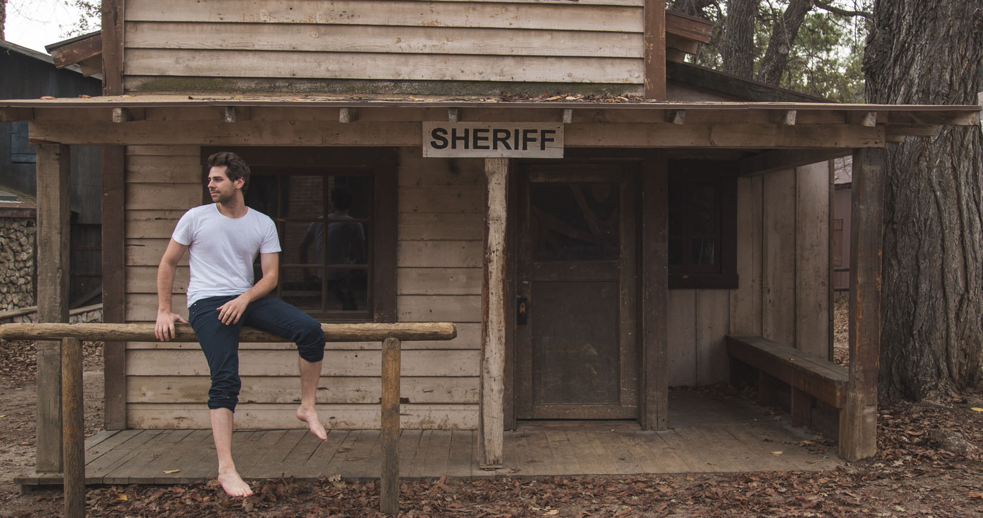
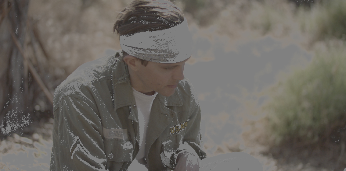
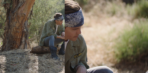
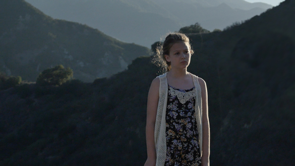
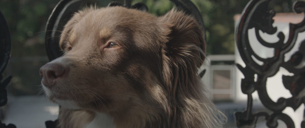
Take a look at the shot below as an example.
Ungraded
![Black and White Color Grading Raw]()
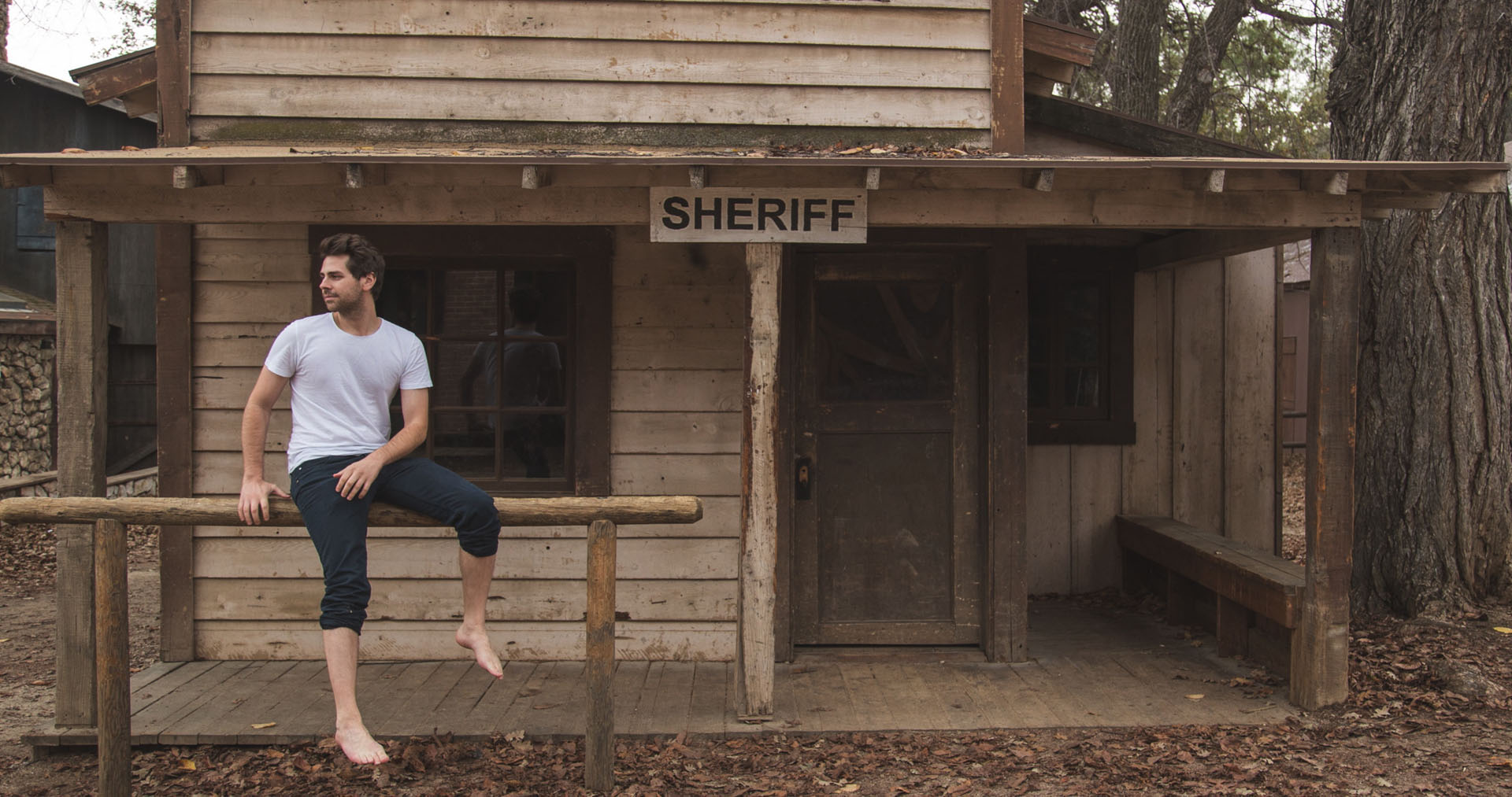
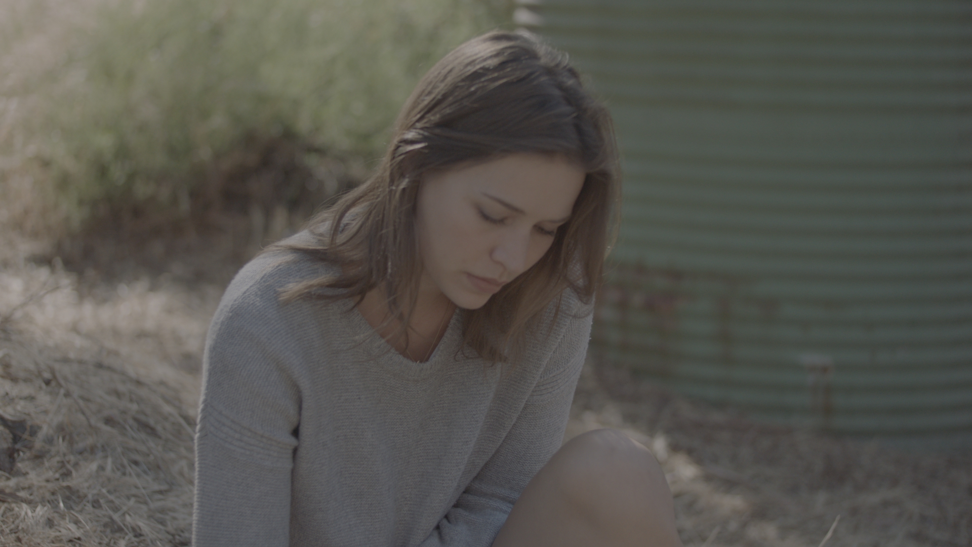
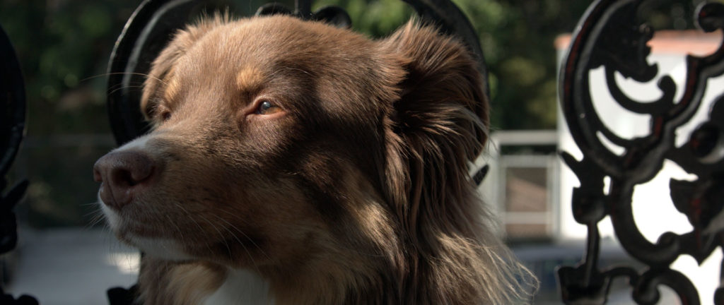
Desaturated
![Black and White Color Grading Desaturated]()
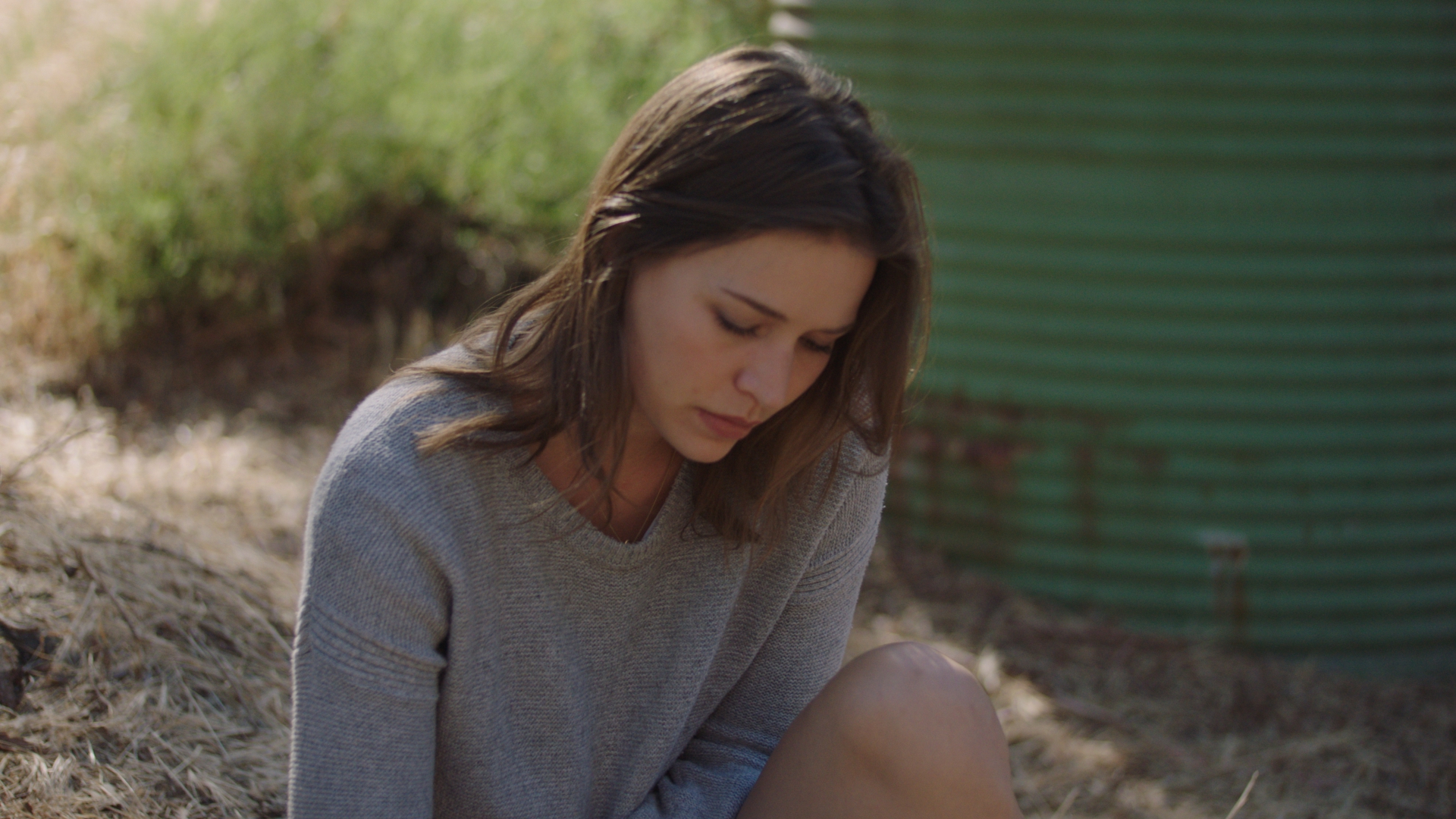
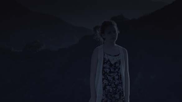
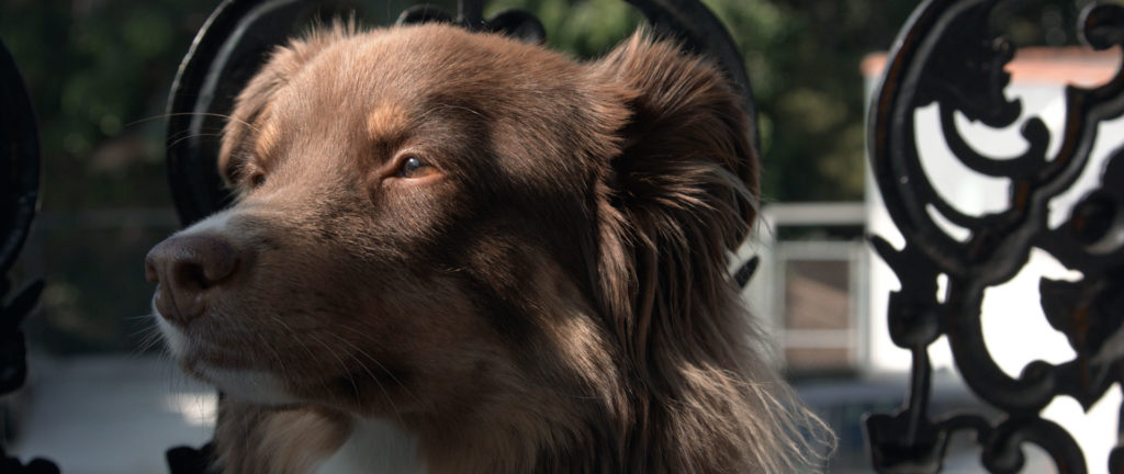
Desaturated + Contrast
![Black and White Color Grading With Contrast]()
The second image clearly looks more like desaturated video, where the final image looks more filmic. This once again, is because many black and white film stocks tended to have more contrast to them, and we have replicated that more accurately in the third image of the series.
With that said, there is a time and a place to lift the shadows on your black and white footage. Sometimes you might want to give your footage a more vintage or nostalgic feel, and bringing up the black levels could be the right choice.
In that case, it’s important that you first crush your blacks, and then lift them up. If you simply leave your blacks lifted and desaturate your image, the shot will look flat and boring. On the other hand, if you add contast to your image and then lift your shadows up, you will achieve a much more interesting effect.
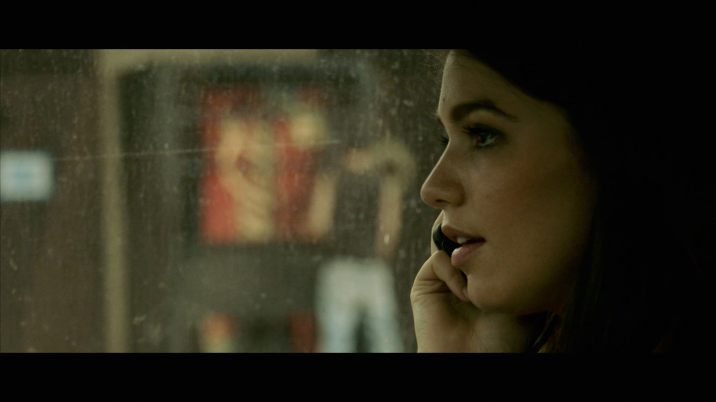
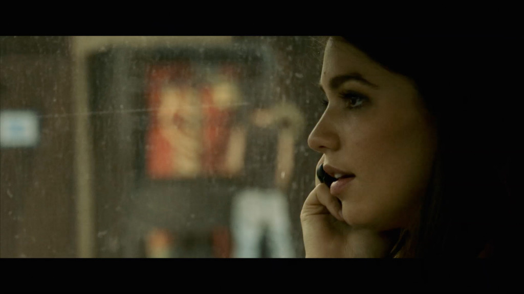
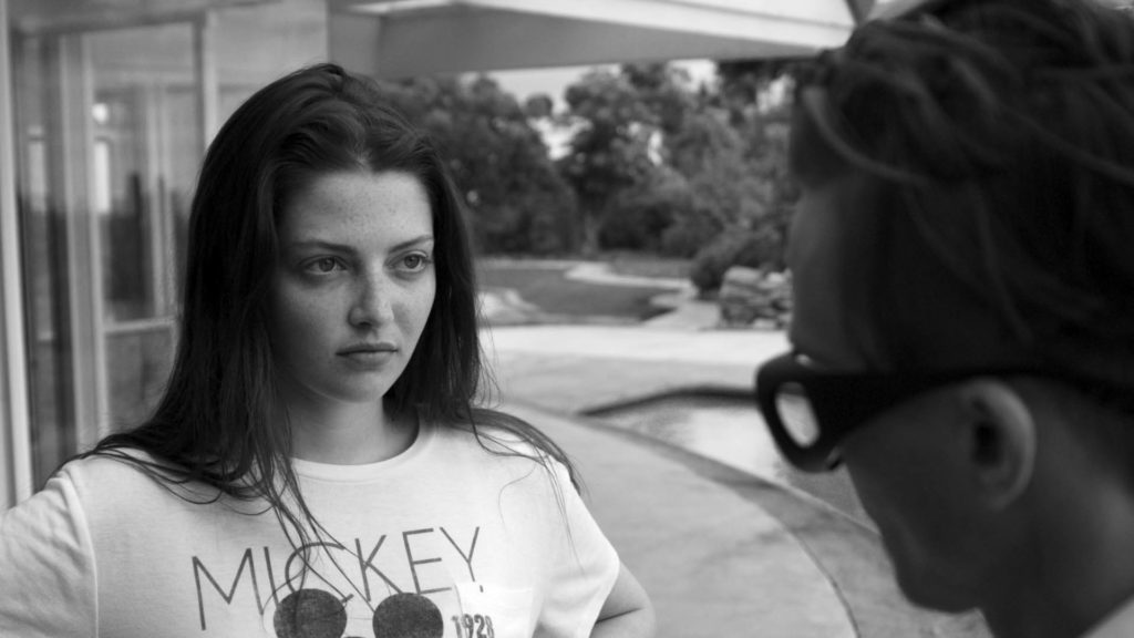
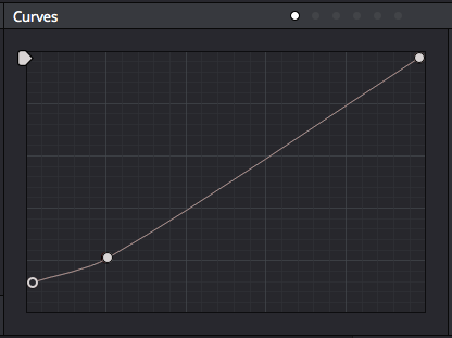
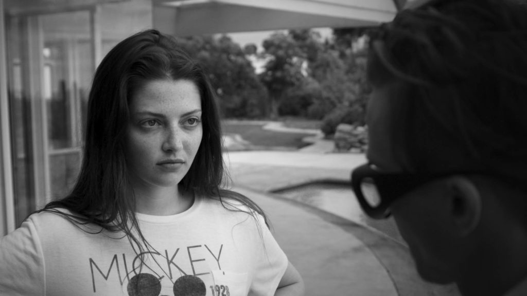
Desaturated + Contrast + Lifted Shadows
![Black and White Color Grading Lifted Shadows]()
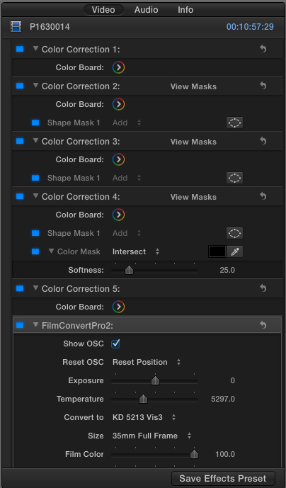
In the example above, lifting the black levels was achieved with a simple curve in DaVinci Resolve that looks like this:
![Black and White Color Correction Cuves]()
So in fact, it’s entirely possible to have the best of both worlds. You can have a relatively high contrast shot that also has lifted shadows – your contrast is just going to live in your mid tones rather than in your blacks.
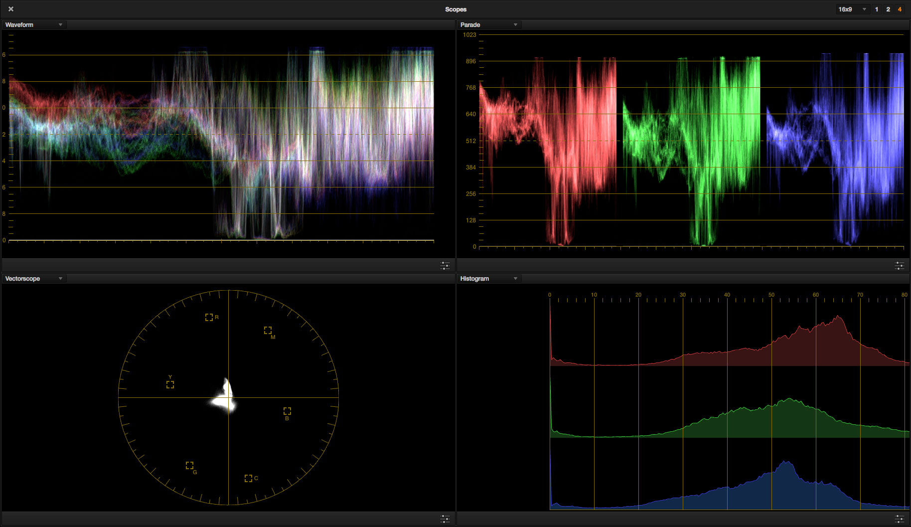
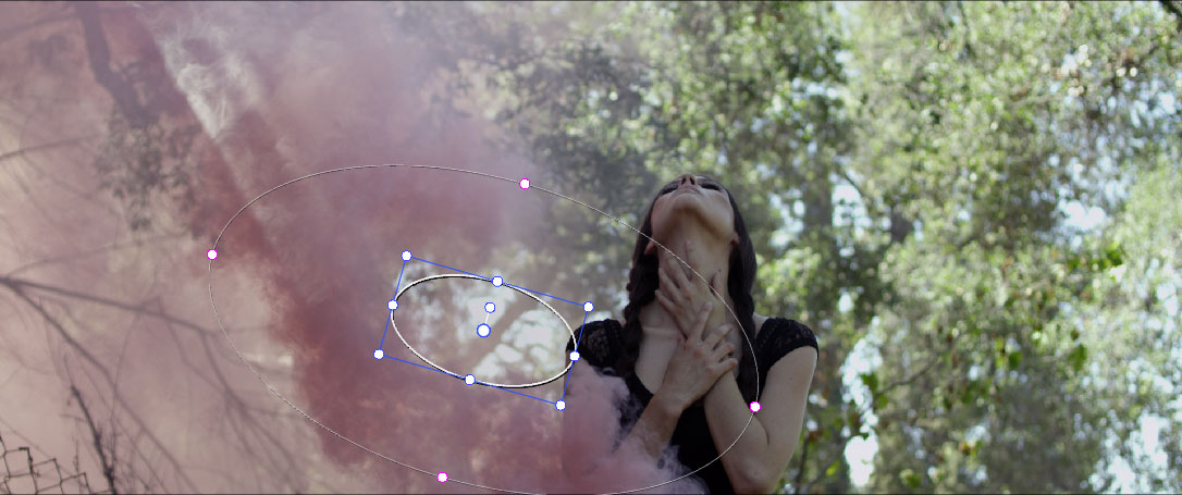
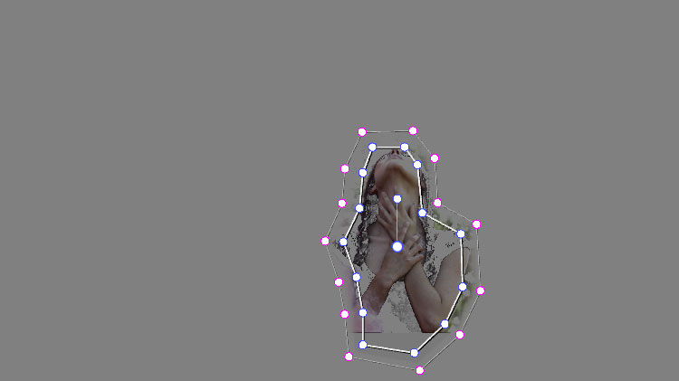
USE POWER WINDOWS ORGANICALLY
Power windows can be a very useful tool when color grading – either to add a basic effect such as a vignette, or to highlight a certain area of the frame that may not have been lit perfectly. With that in mind, I recommend using power windows when they are called for to enhance the B & W look, while being cognizant that the “less is more” approach will almost always serve you best.
One of the most powerful qualities of the black and white look, is it’s ability to hide distracting details. Black and white footage can add mystery or intrigue on a visual level by hiding distracting colors or unnecessary shadow detail. By this same token, vignettes can be used to focus the viewers attention more effectively and hide details on the periphery of the image that may be better left in shadow.
In the example below, the vignette I am using is very subtle, but it’s there. If I were to go overboard and start adding multiple vignettes to highlight different areas of the frame, the organic nature of the shot would be lost entirely. You never want to see a vignette, you should just barely feel it on an almost subconscious level.
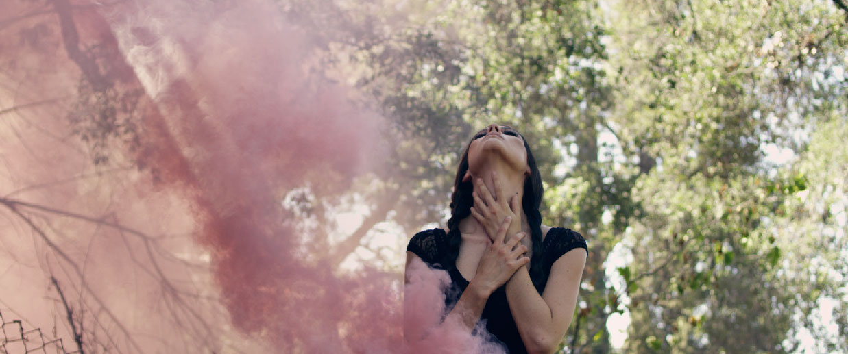
Desaturated + Contrast + Vingette
![Black and White Color Grading With Vignette]()
So remember: Limited use of power windows will help to emphasize black and white’s ability to hide the details, but too much will push you right back into digital territory.
PUSHING YOUR COLORS STILL MATTERS
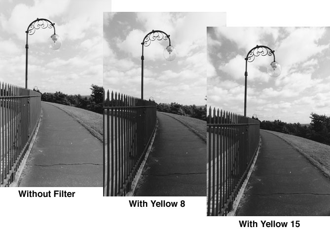
If you were to shoot a black and white image on actual B & W film stock, you would have a couple of options in terms of your production technique. You could simply load a black and white stock into your camera and start rolling, or alternatively you could use a color filter in front of your lens which would have a dramatic effect on the contrast quality of your image.
Take a look at this image from Tiffen, showing what two different yellow filters in front of the lens would do to your black and white shot:
![Black and White lens Filter]()
Different contrast effects could be achieved by using any number of other color filters (not just yellow), each of which will make their own unique mark on the image.
The point is not that you need to shoot with a color filter on your lens, but rather that you can in fact push and pull your color wheels, white balance, curves, and other color settings to dramatically change your look in this same way while color grading.
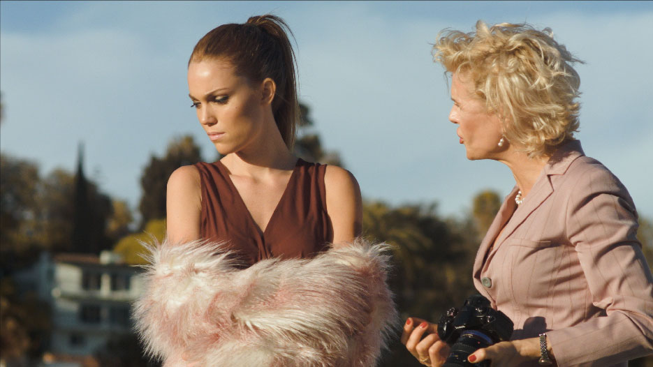
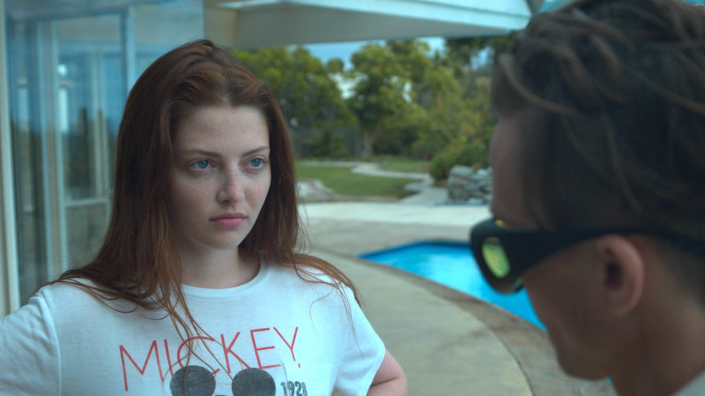
Take a look at the images below as an example. We’ll start with our baseline:
Ungraded
![Black and White Color Grading Raw]()
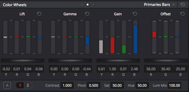
Now we’ll add a really extreme color effect using the primaries bars in DaVinci Resolve like this:
![Black and White Color Correction Primaries Bars]()
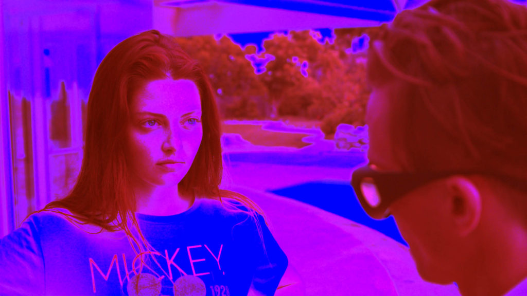
This will give us an image that looks like this before it’s desaturated:
![Black and White Color Grading Red Effect]()
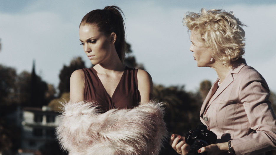
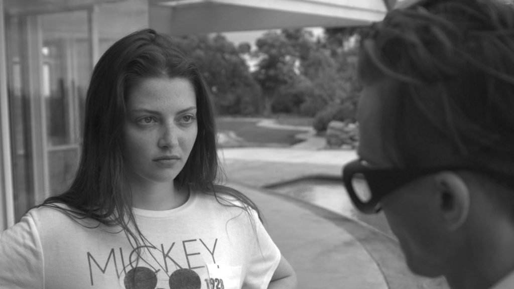
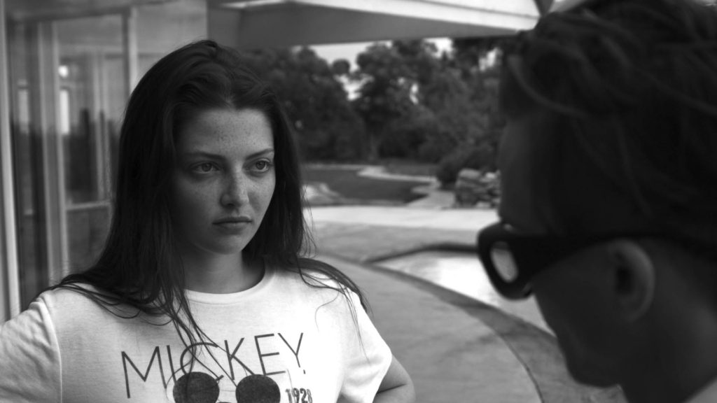
We can then desaturate, which will give us this:
Color Channels Pushed + Desaturated
![Black and White Color Grading With Color Effect]()
Pushing the colors like this obviously has a dramatic effect on the image, and in this case makes things look much more unique and dynamic.
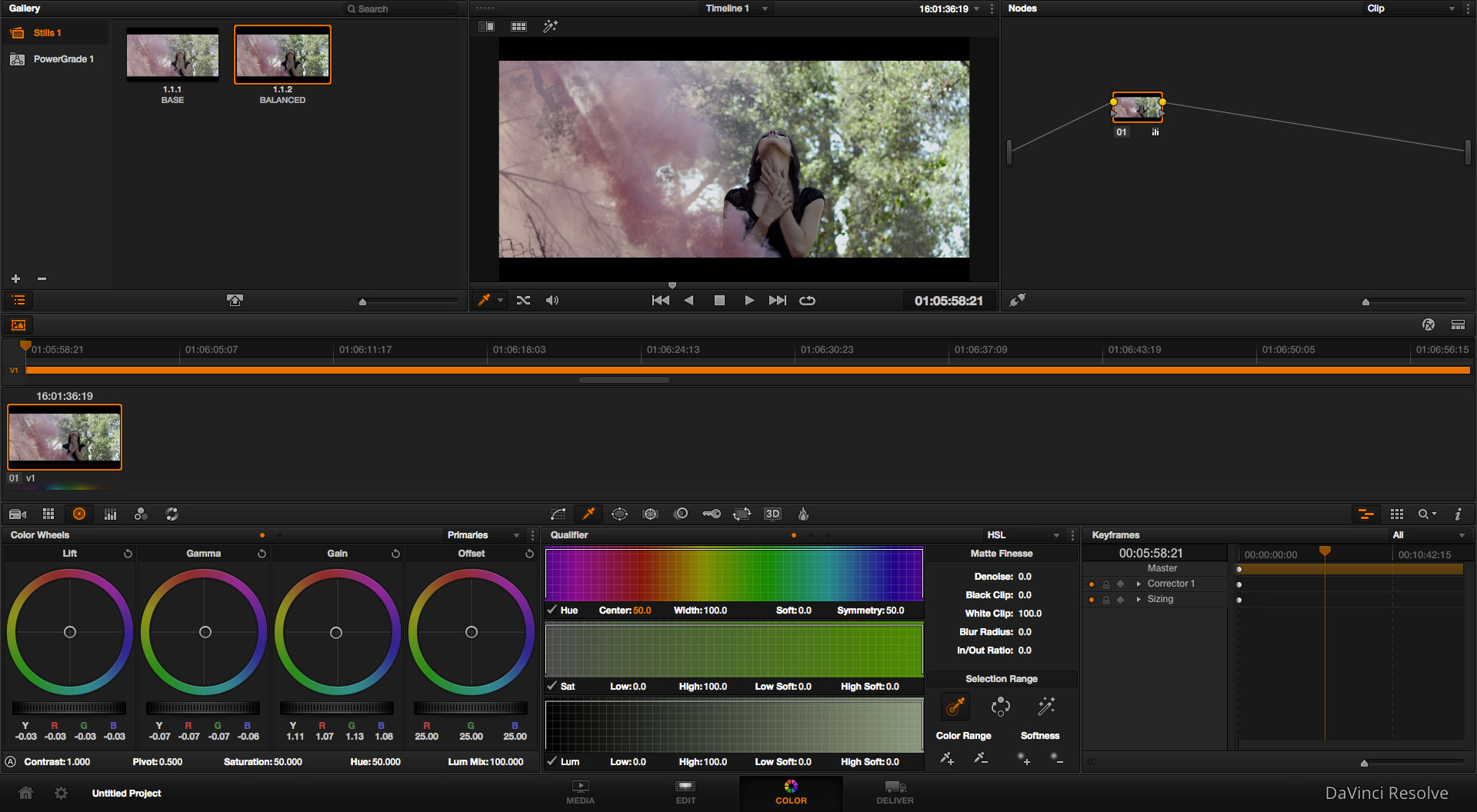
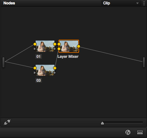
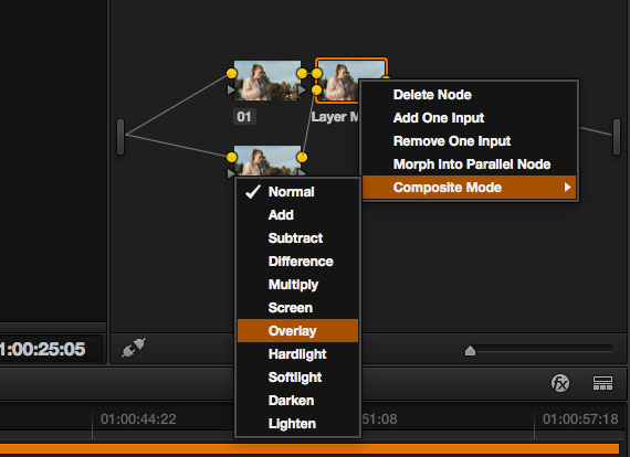
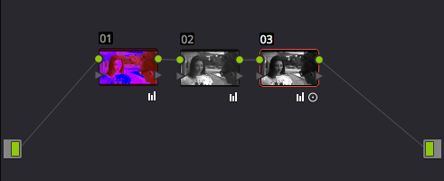
One important technical detail to note, is that in order for this technique to work, you need to make your color adjustments on a layer or node that precedes your desaturation. In other words, let’s say we have three nodes on DaVinci Resolve, they should be set up like this:
![Black and White Color Correction Node Tree]()
The first node should be our color effect (let’s say pushing the red channel up), and the remaining nodes are where we desaturate the footage, add contrast, and make any other final tweaks. If we were to apply the desaturation before the color effect, we would simply be adding color to an already desaturated image.
This order of operations will apply no matter what software you are working in. So even if you are adding layers in your editing software (instead of using nodes in your color software), you will want to stack them so that your desaturation is on top of your color adjustments.
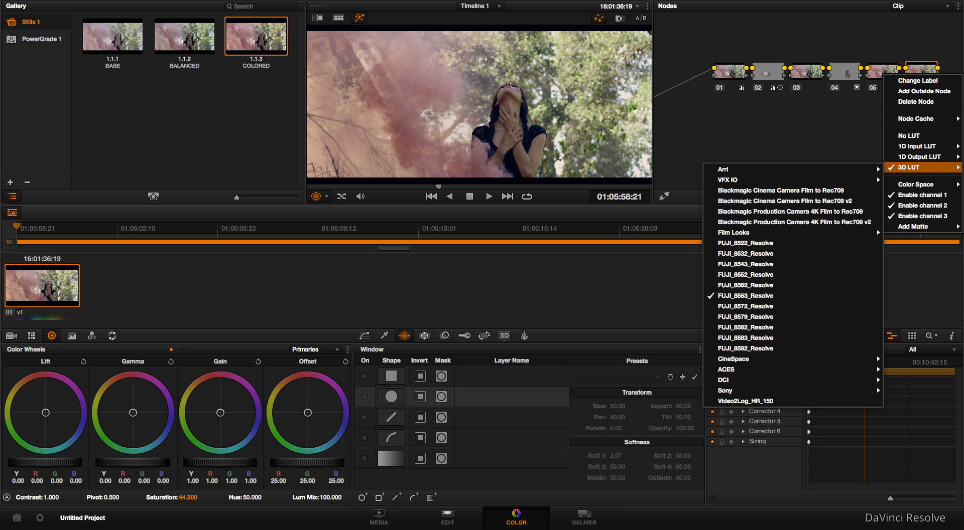
LUTS CAN BE USED
Many filmmakers and colorists are now using LUTs to color their footage, but often feel it is unnecessary when coloring in black and white, since most LUTs are designed for color. With that said, you can still use creative LUTs in powerful ways when grading B & W material, you just need to adjust your workflow slightly.
Much like the previous point that states that any color effects should be added before you desaturate your image (in your layers or node tree), the same applies to color LUTs. Assuming they aren’t black and white LUTs, you will want to add the look of your choice to your footage before desaturating the image.
By doing this, you can still benefit from the design of the original LUT (contrast, levels adjustments, etc.), while using it to stylize your black and white footage in a unique way.
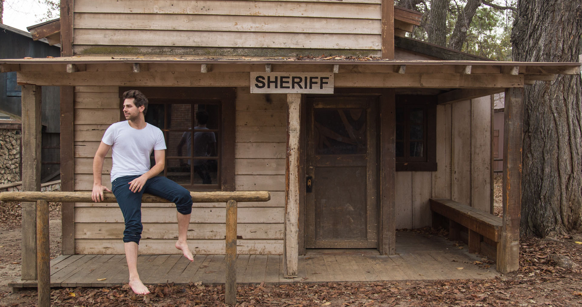
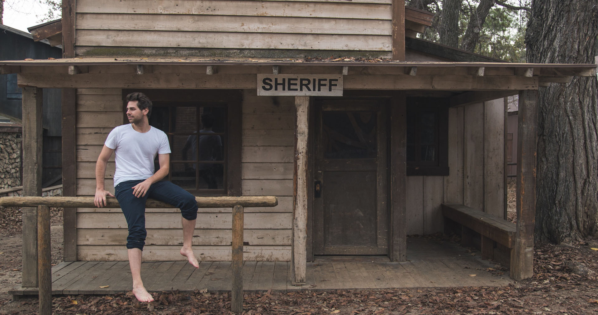
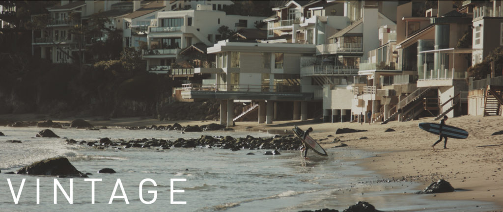
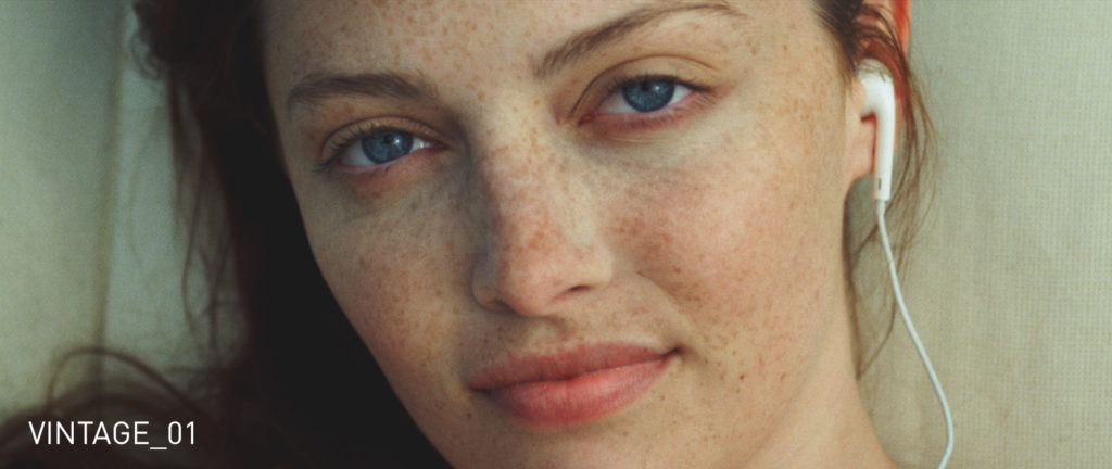
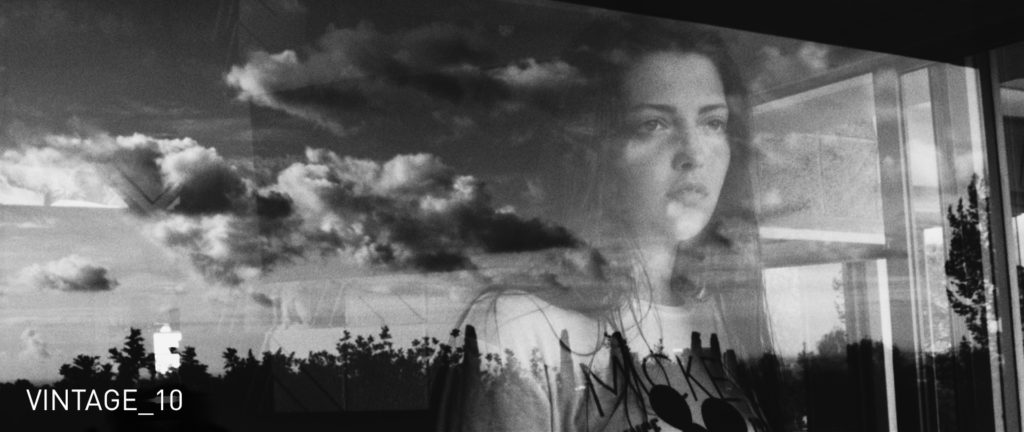
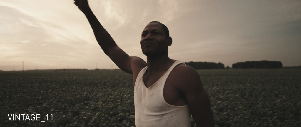
For instance, the second image below uses a Vintage LUT that I am applying from one of my recently released Cinematic LUT Packs.
Ungraded
![Black and White Color Grading Raw]()
Ungraded + Vintage LUT
![Black-and-White-Color-Correction-Vintage-Look]()
Now here is what happens when we desaturate after applying the LUT.
Vintage LUT + Desturated + Contrast
![Black-and-White-Color-Correction-Vintage-Look-Desaturated]()
Obviously there is a big difference in what the final image looks like, even though this particular LUT was designed for color footage. Personally, I love to use LUTs when coloring black and white footage as I can easily cycle through different looks and test out all sorts of unique contrast/color combinations to see which works best on my footage.
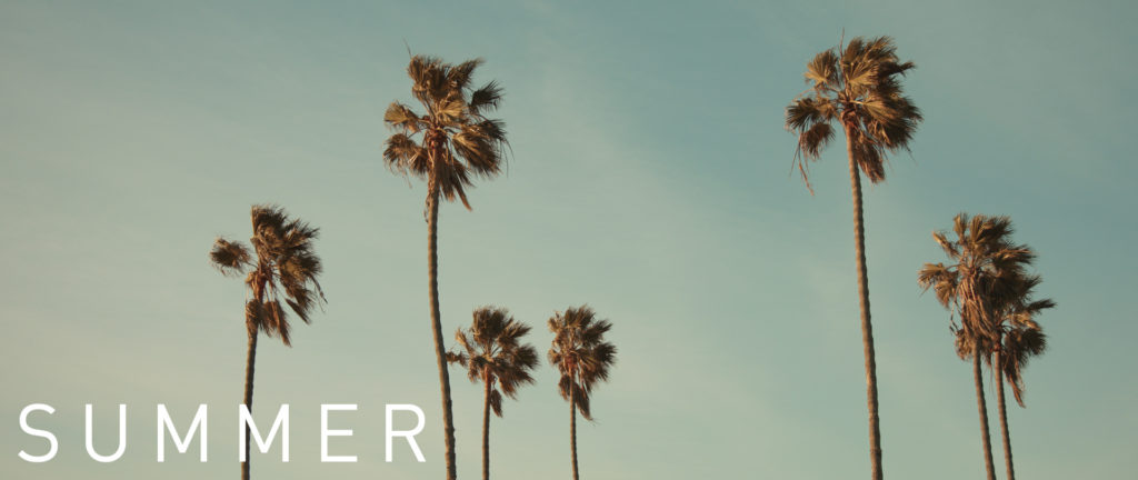
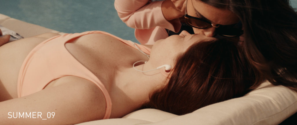
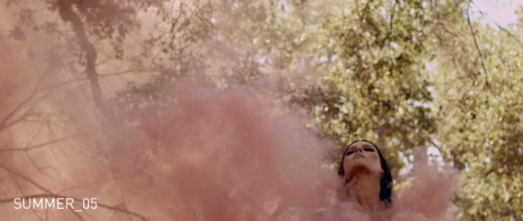
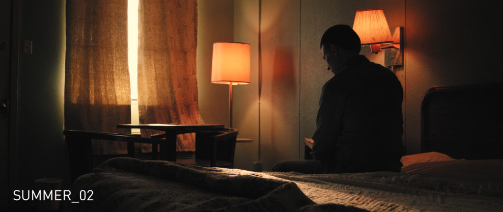
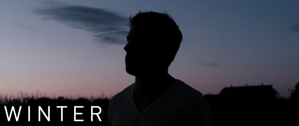
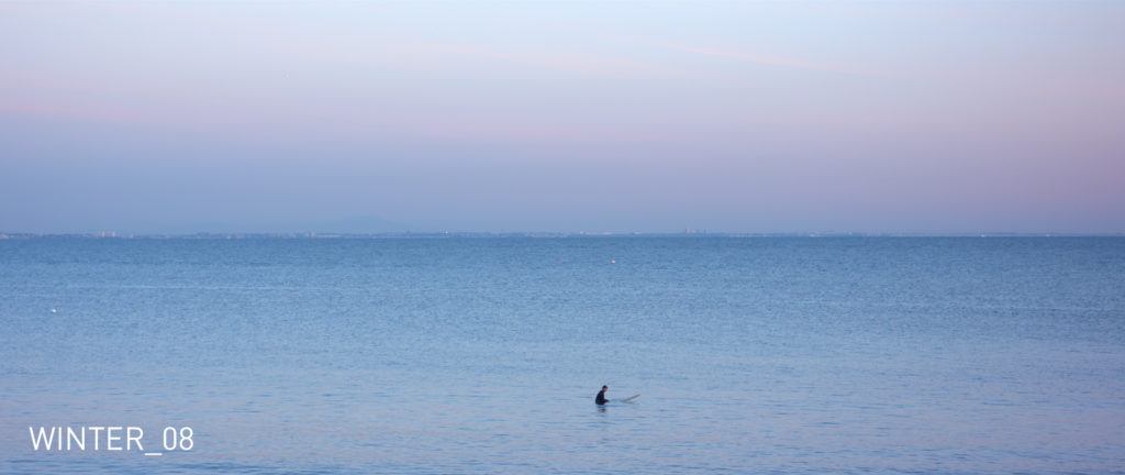
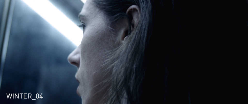
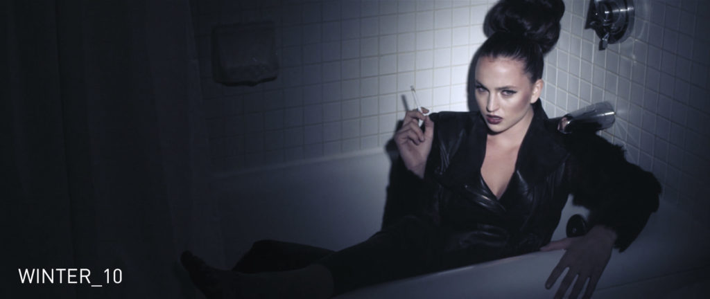
If any of you are interested in learning more about my Cinematic LUT Packs, be sure to click this link. I currently have three different packs available, Vintage, Summer, and Winter. They are designed to be used by independent filmmakers of all skill levels that aim to color their own footage and achieve powerful looks right inside their editing or color software.
That’s it for now. Check back soon for more updates, filmmaking tips, camera reviews, and much more.
And be sure to follow me on Instagram, Facebook, and Twitter for more updates!
Noam Kroll is an award-winning Los Angeles based filmmaker, and the founder of the boutique production house, Creative Rebellion. His work can be seen at international film festivals, on network television, and in various publications across the globe. Follow Noam on social media using the links below for more content like this!