Quantcast
Channel: Editing – Noam Kroll
Viewing all 138 articles
Browse latest View live

What Sets Marmoset Apart From Other Music Libraries: The Search Tool

$
0
0

There are a lot of music licensing sites out there – some good, and others… well, not so good. In some cases, stock music sites simply just don’t offer high quality music. These lower-tier sites are often designed to appeal to the corporate world, and usually offer the cheapest solution for anyone looking for a royalty free track. On the flip side, there are sites that have some really great music, but their prices can be very high and they lack the search tools to help filmmakers find the most relevant music for any given project.

That said, Marmoset – a music agency based out of Portland, OR – seems to offer a best of both worlds solution when it comes to finding the perfect music track. Unlike many other licensing sites, Marmoset is truly a full service agency that is comprised of real musicians, which is why they offer a lot more than just the ability to license tracks. For instance, you can work with Marmoset to have a custom score created for your film, or can bring their team on board with your project to work as music supervisors.

As creatives themselves, the musicians and team at Marmoset really understand the mind of a filmmaker, as their site’s functionality has been designed in a way that makes it highly efficient to find the right track.

Picking music from a library can be an extremely frustrating process. I’ve often spent hours, if not full days going through page after page of music results on different websites, only to have to settle for a track that might not have been perfect for my project. This isn’t because good stock music isn’t out there, but because it can be very hard to find.

Most stock websites use very broad terms to help filter their search results, which don’t really help to narrow things down all that much. You’ll choose from lists titled “Ambient” or “Rock”. Essentially catch-all genres that are not specific enough to narrow search results now, leaving you as the filmmaker with the task of having to sift through hundreds (if not thousands) of un-usable tracks.

Marmoset takes a different approach. They have arguably the most intuitive tool for searching a music library that I have ever used. It very much mimics the methodology that might be applied in a meeting with an actual composer. Instead of being faced with a bunch of generic musical categories to search from, you’re faced with this:

licensing-music

This tool lets you filter results in a very unique way. You start by selecting musical qualities (or moods) that may relate to either your character, project, or story. From there, you can further refine your results in the rest of the categories: Energy, arc, length, vocals, instruments, genres, and customizable tracks.

marmoset-music

Some of these filters are very powerful. One in particular that I love is the “arc” filter. In this tab, you can choose to find tracks with a steady build, multiple crescendos, a frenetic pace, or several other variables. This is massively helpful, as it not only allows you to find music has the right sound, but also music that matches the pace of your edit. In many ways, this filter replicates your first conversation with a composer, where you are bound to discuss pacing along with mood and genre.

music-licensing-sites

Other stock licensing sites offer some of the same tools, but rarely are they actually implemented this effectively. I’m finding that I have the ability to locate a great track in far less time using this tool set, which is a testament to both the search tool itself, and the quality of music on the platform.

So if you’ve been having a hard time finding the right tracks for you projects, give Marmoset a whirl. It might help to speed up your process and deliver some really great quality results. I’ll leave you with their promo spot below, which outlines their process:

Be sure to check out www.marmosetmusic.com for more info, and let me know what you think.

For more content like this, be sure to follow me on InstagramFacebook, and Twitter!


Noam Kroll is an award-winning Los Angeles based filmmaker, and the founder of the boutique production house, Creative Rebellion. His work can be seen at international film festivals, on network television, and in various publications across the globe. Follow Noam on social media using the links below for more content like this!

A Non-Technical Approach To Achieving The Cinematic Look

$
0
0

As independent filmmakers, we’re always chasing the elusive “cinematic look”. The ultimate goal is usually to increase production value and produce content that resembles higher end feature films, even when shooting on a tight budget. More often than not, filmmakers look to the technical facets of production (camera settings, recording formats, lighting science, etc.) as a means to achieve a more cinematic look and feel. But more often than not it’s the creative choices, not the technical ones, that make all the difference.

For the record, I am all for taking advantage of technical knowledge and tools to increase your production value. I’ve written many articles on how to achieve the cinematic look when shooting digitally, most of which deal with technical considerations – usually in the lighting, camera, or color departments. But in order for a film project to feel truly cinematic, it needs to offer the viewer more than just a cinematic “look”. It needs to evoke a certain mood or emotion for the audience on a subtextual level, that can only truly be crafted through careful creative decisions. The technical facets should simply there to elevate an existing creative intention.

With that in mind, below are some of the key creative considerations to take account account when working on your next film:

Non-Traditional Coverage

I’ve seen countless independent films that are shot beautifully, but are ultimately covered in a way that looks more like a 90’s era sitcom than a feature film. Unfortunately this type of generic approach can have a detrimental effect on the viewing experience, and can take away from the originality of the film as a whole.

Coverage of course refers to the way you choose to shoot your scene during production – including how many angles are covered, and how much of the scene is shot from each angle. Many film schools teach students a very standard type of coverage, where a master shot captures the whole scene, and then close ups on each of the actors capture their dialogue or reaction shots. This is a fairly basic approach that may work well sometimes, but in many instances won’t afford the filmmaker the ability to express their scene in the most interesting way possible. This can be a wasted opportunity as unique scene coverage is one of the most effective ways to make your film more captivating, and in turn more “cinematic”.

For instance – instead of shooting a scene at a dinner table with a wide master shot and closeup single shots on each actor, imagine shooting it all in a single take. The camera could roam from one character to another as they each speak, or it could just hold on one of the characters, leaving everyone else off screen. Both options would tell the audience something entirely different about that scene.

Using the same basic scene example from above, you could also opt shoot a ton of coverage for the scene, capturing loads of tiny detail shots – the cutlery, food being chewed, lightbulbs buzzing, etc. in addition to extreme closeups on the actors. This would give you the ability in the editing room to create a very frenetic tone.

There are literally endless options when it comes to covering your scene, so don’t always feel like you need to default to the same traditional wide-shot/close up coverage every single time. There are going to be scenarios where standard coverage may be the best choice… But more often than not you will be better served by really identifying the heart of your scene, and then building your coverage around it.

Locations & Art Department

It’s not uncommon for filmmakers to spend an inordinate amount of time on camera & lighting prep, while focusing very little time on locations, art direction, and set design. This type of lopsided approach can lead to productions that look pretty good from a technical side, but are visually uninspiring in other respects.

During pre-production, a finite amount of time is available and must be balanced between many elements – casting, crewing, location scouting, wardrobe, camera prep, script revisions, and so on. The more time that is spent on any one area, the less is left over for another. If you focus too heavily on one area (usually the camera department), you are going to miss out on opportunities to develop a unique visual style for your film in other ways – most commonly with your location/art department choices.

Personally, I would rather shoot on a DSLR in a gorgeous location with beautiful production design, than shoot on an Alexa in a location that is just not right for the film. Don’t fall into the trap that so many filmmakers do, of obsessing over your camera/lens package and not looking at the bigger picture. I’ve made this mistake before and have regretted it deeply!

Assuming you are the director of your project, you are responsible for the mood and tone being conveyed to the audience. The locations that you choose and the production design associated with those locations are absolutely crucial to the world you are creating. At the end of the day, these choices will add a tremendous amount of value to your production that simply can not be made up for in any other way, so always prioritize them – even if it means cutting budget from your camera department or other areas.

Creating A Visual Language

Great films are able to express a distinct visual language, identifiable motifs, or other aesthetic properties that make for an extremely unique viewing experience. These visual cues are most often derived from the theme or moral center of the story, and serve as a constant, subtle reminder to the viewer of the underlying message behind the film. Sometimes, rules are even set up before filming that might dictate how shots are framed, what focal lengths are used, and how camera movement is treated.

For instance, a dramatic film dealing with a character who feels isolated from society will have a very different visual language than a comedic film centered around an ensemble cast of a group of friends. In the former example, a director might decide to always shoot the isolated lead character in a single shot (no two shots or group shots), visually separating them from the other characters, who might be framed up together. The decision could also be made to frame certain shots with a lot of headroom or negative space to make the lead character feel very small.

These are just a couple of simple examples, and there are no hard and fast rules in terms of developing a visual style that might guide your film. You might choose to shoot everything on a single lens, or you might decide that all camera movement must be limited to dolly moves. Possibly you decide to light your protagonist in a different way than the rest of the cast, or you choose to shoot all of your closeups with wide angle lenses….

No matter what decisions you make, always make sure that they are in the best interest of the story’s moral center. Don’t simply make decisions because they may be convenient or help your movie look “better”. Instead, root them in your story’s thematic premise, allowing the viewer to connect with your film on a subtextual level.

Restrained Editing

Not all discussion of the cinematic look needs to refer to production. A lot can be done in the post suite to elevate the cinematic qualities of your film – and I’m not just referring to color grading. As an aside, color grading is an excellent way to further enhance the visual style of your film, but for the purpose of this post I want to focus on picture editing.

Assuming you are working on a film that has been shot with a reasonable amount of coverage, you have the ability to completely re-shape the tone of any given scene in the editing room. This is both a blessing and a curse. Many filmmakers feel the need to use as much of their footage as possible in the edit, simply because it was shot or because it looks good. In most cases though, a more restrained and purposeful approach to the edit will serve the film best.

Imagine you’re editing a scene where Character A enters a room to talk to Character B, who looks upset and is staring out a window. If you had shot a lot of coverage, you might choose to do the obvious in the editing room – start with the wide shot of Character A walking in, and then cut to closeups of Character A and B once their dialogue starts. This might work out okay… But what if you were to do the opposite? What if you start the scene on a closeup of Character B, and held there for a very long time. You might only break away to the wide shot halfway through the conversation between the two characters, during an intense moment. This would be a less traditional and less expected choice, and perhaps one that is more meaningful to the scene.

This is of course just a theoretical example, but the point is you should always be looking for ways to re-work your scene in the editing room. There are times when a more conventional approach to editing your scene might work best, but never feel like you need to use every single piece of coverage you have in the edit. Doing so may lead you to cut a scene in a more generic way that is far less powerful and not as specific to your story.

Creative Sound Design

While this post is all about the cinematic “look”, there is arguably no better way to enhance the visual perception of a film than by coupling it with powerful sound design.

Many filmmakers think of the sound design process as primarily technical, and in many respects it can be. That said, sound design (and music) will affect the mood of your viewer more than almost anything else, which is why it always needs to be taken into account very early on in the creative process. It should never be an afterthought.

Great sound design starts in pre-production. A director with a strong vision for his or her film will have a very solid idea of how they are going to approach sound in post very early on. Take a film like Whiplash as an obvious example. The film’s approach to sound was so strong that it earned the film an Oscar for sound editing, and much of it’s success in the sound department can be traced back to the script – where crucial sound design choices were literally written into the screenplay. An intense description of how the sound would be integrated into the film was present from development and pre-production onwards, and it ultimately it served to create an auditory experience that elevated the execution of the story tremendously.

Whiplash is of course a unique example in that it takes place in the world of music, so naturally a heavy emphasis was placed on sound. With that in mind though, we can all learn something from this level of attention to detail, and we should all be looking for ways to create original soundscapes that are relevant to our stories and themes, in order to heighten the viewing experience as a whole.

Final Thoughts

There are countless ways to make your film look and feel more “cinematic”. Many are technical, but just as many as creative, and it’s the harmonious marriage between both the creative intention and the technical execution that will make your project feel more filmic, or cinematic – whatever that may mean to you personally…

It’s always important to start your process with creative decisions, not technical ones. Your first step should be identifying the theme or moral center of your story. From there, ask yourself some important creative questions with regards to your visual, editorial, and sound choices that may further enhance or at the very least support your thematic premise. From there, you can move to the technical-side, and ensure that any technical decisions that are made are in full support of the creative choices already in place.

For more content like this, be sure to follow me on InstagramFacebook, and Twitter!


Noam Kroll is an award-winning Los Angeles based filmmaker, and the founder of the boutique production house, Creative Rebellion. His work can be seen at international film festivals, on network television, and in various publications across the globe. Follow Noam on social media using the links below for more content like this!

7 Ways To Speed Up Your Color Correction Process While Dramatically Improving Your Results

$
0
0

Color correction is one of the most rewarding stages of post-production – largely because it allows us as filmmakers to breathe new life into our projects from a visual standpoint. At the same time, it can be one of the most frustrating stages of post, as many filmmakers find themselves struggling tiresomely to find the right look and the best way to implement it. Like any other facet of filmmaking that is both creative and technical, color correction needs to be approached methodically and purposefully in order to achieve the best results in a short amount of time.

I’ve color corrected hundreds, if not thousands of projects, and there is no question that the projects that I was able to do the best work on also were completed in the shortest amount of time. Now, I’m not suggesting that you rush through the color process, or that there aren’t projects that call for a lot of time in the grade… But in many cases, a shorter color process is a good sign, as it shows that the filmmaker has truly identified the look they want to achieve, and has streamlined their process in the color suite to maximize results.

With that in mind, here are my 7 tips for speeding up your color process while improving your creative output:

SHOOT FOR THE GRADE

Some of you that are reading this are not only colorists, but also directors or DPs. And if you fall under the general “filmmaker” umbrella in any way, it’s important to recognize that your ability to achieve great results in the color suite starts during production.

Technically-speaking, it goes without saying that you (or your DP) must understand which settings, color spaces, picture profiles, and codecs are going to give you the best results in post. You essentially need to know the breaking point of your camera, and do enough camera tests to figure out which combination of settings will be most conducive to the look you are after… And sometimes the most obvious choice isn’t always the right one.

For instance, you might be tempted to shoot in a Log color space on your DSLR (since that’s what many filmmakers recommend), but through testing you may realize that your camera will actually deliver better results if you shoot in Rec. 709. Choices like this may sound counter-intuitive on paper, but in fact there are some cameras – namely certain DSLRs – that don’t handle Log color very well, and this is something you need to take into account on set.

This is of course just one example, but the overarching point is that you need to run tests for yourself during pre-production. Don’t take anyone else’s word for what is going to work best for your film.

From a creative standpoint, you need to take into account the color process when making any key production decisions that may have an affect on your visuals. These include decisions on lighting, props, locations, wardrobe, and literally anything else that shows up on the screen. Remember that whatever look you are going to aim for in the color suite is going to either be helped or hurt by your work on set. So decide on the look you want up front, and let it have an influence on your creative visual choices along the way.

Following this basic logic during production will help you save countless hours in the color suite, which would otherwise be spent fixing issues or creating a look that wasn’t there to begin with.

CREATE A COLOR STRATEGY

Virtually every filmmaker with some degree of experience understands just how critical planning is to every stage of production and post. A writer isn’t going to type FADE IN:, until they have an outline. A director isn’t going to step on set without a shot list. So why would a colorist start their creative process without any sort of blueprint?

Unfortunately, color correction is often approached as a bit of a trial and error process, in which filmmakers will wing it – desperately searching for the right look along the way, without any sort of concrete plan or methodology. Working this way can result in a ridiculous amount of wasted time, which is mostly spent auditioning looks that are completely wrong for the film.

In an ideal scenario, a filmmaker’s basic plan for color correction would be in place before the film is even shot, as we already touched on above. This would provide consistent visual direction during production, and the same color strategy could then be carried over into post.

But let’s assume for a minute that you are a colorist that is working on someone else’s material that was shot without a strategy. You can (and should) still come up with your own color strategy during post-production… And it should begin before you even open up DaVinci.

At the very least, you’ll want to know what type of look you are after – Do you want something that looks heavily stylized? Or do you want a natural look? Should it look vintage? Or is a contemporary look more appropriate? These are basic questions that you should ask yourself up front. From there, you want to make decisions on the color palette as a whole: Warm vs. cold, saturated vs. desaturated, and so on. It’s also important that you understand which scenes or sections are going to be colored in any given way. Is your whole film going to have a color wash to it? Or do you want each scene to have it’s own look?

Ask these questions early on. Doing so will save you a ton of time that might otherwise be spent creating intricate looks that will likely later be abandoned.

UNDERSTAND THE ORDER OF OPERATIONS

As with any other part of your post-production pipeline, there is a standard workflow and protocol for color grading your project that will speed up your process substantially. This is usually referred to as your order of operations.

Just as an editor will pull selects first, then start working on an assembly cut, then move to a rough cut, and so forth – a colorist has a defined process as well. Once the picture is locked and the color session is set up, a colorist’s first step is to balance all of the shots. In other words, shots that have white balance issues, inconsistencies in contrast, or other general problems need to be addressed first. The goal is to get all of the footage to a neutral starting point before moving ahead with the more creative color work.

Many amateur colorists make the mistake of jumping right into their creative look before balancing their footage, and spend ten times longer coloring their projects than they would have if they followed the correct order of operations. This is because it is nearly impossible to apply a stylized look across a full sequence with any degree of consistency if the individual shots were not each balanced to begin with. A look that works well on one shot will not be able to be seamlessly applied to another in the same scene or sequence if they aren’t both matched before-hand. The result will be an inconsistent looking sequence of shots, and any attempt to fix these issues after the creative look has already been applied will be massively time consuming.

I’ve actually written an entire article on the ideal order of operations for color grading, which can be read here.

START WITH THE WIDE SHOT

Assuming you are color correcting a scene that has a wide angle shot in it, coloring that shot first will almost always serve as your best starting point.

Often times, colorists will simply start to color correct the very first shot in the scene, and then move sequentially throughout the rest of the scene or sequence, shot by shot. In some rare cases, this might work out just fine. But in many instances, especially when the first shot is a closeup, it will not offer the most efficient or effective workflow.

The issue with coloring a closeup or insert shot first, is that it’s not likely to showcase the full color palette of the scene. Say for instance you are grading a scene that features a man leaning against a tree. If you were to color the closeup first, you might only see his face and the blue sky behind him in the shot. This would lead you to make different color choices when compared to the wide shot, which would also reveal the brown tree, the green leaves, and other colorful details in the background.

So in a nutshell, to avoid wasted time when coloring any scene, always start with a wide shot – or at the very least the shot that has the most color information in it. From there, the look you’ve created should apply seamlessly to any other shot in that scene.

LIMIT MASKS & KEYS

When you first start working with professional color correction software like DaVinci Resolve, it’s tempting to go a bit crazy with the use of masks and color keys. Once you realize how much you can use masks (power windows, vignettes, etc.) and color keys (selections of color that can be independently adjusted), the possibilities seem endless. You could practically change the lighting of a scene in post, or alter the color of someone’s clothing. There is so much that can be done, but pushing things too far can hurt your finished product dramatically.

As with many other facets of film, less is more when it comes to color grading. Even in instances where you are going for a really extreme or bold look, achieving this type of look (or any other for that matter) shouldn’t be overly complicated. Masks and color keys should not be relied on as a means to achieve any type of creative look that will be used over the course of your entire film… At least in my opinion. Instead, masks and keys should be used to enhance an existing look, or correct for certain issues that may occur in individual shots that have problem areas.

If you are coloring a feature film and get into the habit early on of pulling keys and adding masks to every single shot, your film is probably going to suffer. There are exceptions to this rule, but generally speaking your film will almost always look better by taking a simple, purposeful approach to your color process, as opposed to a highly technical one that is overly reliant on very specific corrections. This is because maintaining consistency across a 90 minute feature when pulling multiple keys in every shot is nearly impossible, and the time that it will take you to do so can be practically insurmountable.

USE LUTS

I am a huge advocate of using creative LUTs, and am constantly creating my own LUTs to use on projects as a means of speeding up my creative process. LUTs offer the ability to quickly add creative looks to your footage, which will not only allow you to work faster, but also to experiment with different styles in a highly effective way.

Earlier I spoke about how important it is to have a strategy when you begin your color process, which will certainly prove to be invaluable on any project. But no matter how much prep work you do, there will still be some creative interpretation that will be left to your color sessions. For instance, you might know that you want your scene to have a very warm look to it, but there are many different types of warm looks to choose from. Some are more orange, while others are more red. Some have cooler tones in the shadows to add color contrast, whereas others offer more of a warm color wash.

LUTs allow you to experiment with variations of looks very quickly and easily. You can simply apply one after another to your footage, until you find one that is closest to the look you are after. You may still want to tweak the color to customize the look even further, but the LUTs will have given you the ability to see so many different possibilities instantly, and save hours of time that could have spent experimenting manually.

On a side note, you can check out the Cinematic LUT Packs that I’ve created here.

TAKE BREAKS

Color correction should always be treated like a marathon, not a sprint. Your eyes literally get adjusted to the colors that you are staring at, and after a certain point when you have worked for too long, you just aren’t going to see clearly.

Many colorists make the mistake of sitting in the color suite for hours on end, only to look back at their work the next day and realize they need to re-do a lot of it. While it may be tempting to simply power through a color session and get your entire project done in one shot, it’s rarely that simple – unless you’re working on something extremely short, like a 30 second commercial.

For the most part, you need time away from your work to come back with fresh eyes and look at what you’ve done objectively. I typically recommend taking breaks in two different ways:

First, I always suggest not working for more than 2 hours without taking at least a 15 minute break to leave the room, go outside and let your eyes adjust. You will be amazed at how different your work will look when you come back.

I also like to recommend taking mini-breaks from your shots while coloring particular scenes, especially when you’re having a hard time getting into a groove. If you’re stuck on one shot for twenty minutes, chances are you should just move on to another shot and come back to it later. Either the shot you’re working on is already done and you are over-doing the color on it, or it needs a fresh perspective, which you won’t be able to give it since you’ve been staring at it for so long.

While taking breaks may seem like it would add time to your color process as opposed to tightening it up, in fact the opposite is true. Those small investments of time in the form breaks during or after your color session, will allow you to get to the finish line more efficiently in the long run.

That’s about it for now!

For more content like this, be sure to follow me on InstagramFacebook, and Twitter!


Noam Kroll is an award-winning Los Angeles based filmmaker, and the founder of the boutique production house, Creative Rebellion. His work can be seen at international film festivals, on network television, and in various publications across the globe. Follow Noam on social media using the links below for more content like this!

The Most Important Lesson I’ve Ever Learned About Editing Narrative Film

$
0
0

I recently came to an important revelation: For years I’ve been approaching my editing process completely in the wrong way.

It was only after editing countless narrative projects that I began to slowly develop a new method for approaching the edit… One that allows for a more intuitive process, creates a faster turnaround, and drastically improves creative results in every respect.

As filmmakers, we often step into the editing process with a very specific vision in mind. This is especially true for those of us that are editing material that we’ve also written or directed. We’ve visualized the story over and over, and can envision a life-like picture of what the film is going to look like once it’s all put together. Naturally, this vision is what drives our initial decisions in the editing room, and our instinct is to want to match the footage we’ve captured on set to the story we wrote on the page.

In reality though, this kind of approach can actually be detrimental to the editing process, primarily for one reason –

No matter what level you’re working on, many creative elements in your film will inevitably morph and change as you move through the various stages of the process. From concept development to the first draft of the script, things will change. From the final draft of the screenplay to principal photography, things will change. And from production to post-production, things will definitely change – whether you want them to or not.

In order for a film to be the best it can be, the filmmaker needs to be willing to break away from some aspects of their original vision, and use the material they have captured to charge forward in a new direction – Ideally, one that will offer something far better than they imagined.

Filmmakers, especially those early on in their careers, often treat the script as a literal roadmap which can never be strayed from. This inevitably leads to missed opportunities to let the film take on a life of it’s own… To let it grow and adapt and change for the better as it flows through each stage.

With that said, I do want to point out that it goes without saying it’s crucial for any film to have a consistent vision and tone that will exist throughout the entirety of the filmmaking process. You certainly don’t want to flip flop on elements like theme, character, and tone as you move throughout the various stages. However, the way in which to execute on these elements and to deliver the message of the film almost certainly needs to change and adapt as the film comes together.

This reality is most apparent during the editing phase. By far.

Personally speaking, I’ve been slowing learning this lesson and really trying to embrace the bottom line:

You need to listen to your material. Your footage will tell you how it needs to be edited, not the other way around.

Like most filmmakers, instinctively I almost always approach the editing process backwards. I start to take the footage that I’ve captured and force it into a format that most closely resembles what I’ve have in my head since the script was first developed.

The issue of course, is that I’m not editing the script. I’m editing footage that has changed in countless ways  from what it once was in it’s infancy. If I make edits to my material today that are based on decisions that I made months ago before the film was even shot, I will almost definitely go down the wrong path.

That’s not to say you can’t edit a movie that way – I’ve done it before many times, as have countless others… But the point is that 9 times out of 10 (or more) your end result will be far better if you approach the edit as an entirely new process, completely independent of any bias or preconceived notions.

I’ll give you an example from my feature film which I have been editing over the past few weeks –

There’s a scene that takes place early on in the film where the main character hitches a ride with two strangers, and they get to know each other in the car. The scene was written carefully and purposefully, and there was a clear intention behind why it was written the way that it was. On set, the actors all performed beautifully, and we really had no major technical issues to work around… The point being, had I chosen to edit that scene exactly the way that it was written on the page, I easily could have.

And in fact, I did.

My first attempt at editing the scene was a very literal one. I cut it almost exactly to the script, and while the scene worked well on some levels, it didn’t have the spirit that I had envisioned during the writing process… And I definitely didn’t want to just settle on this first pass and move on, as I knew this particular scene had a lot of untapped potential. It just wasn’t hitting the mark quite yet.

So what did I do? I stopped forcing a square peg into a round hole. I stopped telling the footage what it had to be, and I started listening to it. I stepped back and started from scratch – watched every frame again, and selected new takes and shots that I liked without any bias or attention paid to how the scene was written.

I was just looking for the most interesting and relevant material.

I pulled completely new reaction shots, different cutaways, alternate lines of dialogue that were improvised, and even set aside some candid shots of the actors that were captured in between takes while the cameras were still rolling.

This left me with a bunch of jigsaw pieces. A ton of little clips that were all interesting in their own way, but didn’t really match what was originally written in the script… And that was the point. I was going to take these little pieces, shake them up, and see what came out on the other side.

The re-cut process involved mixing and matching reaction shots with footage from different takes, adding suspense by building out pauses and breaks that weren’t actually there to begin with, and even reordering the dialogue so that certain lines would play out in a different order.

In the end, the re-cut version of this scene was undeniably much stronger than original in every respect. Although the scene now played out on screen very differently than it was initially written, from a tonal standpoint it actually matched the spirit of the script far better than the more literal attempt at the edit.

The approach not only allowed me to cut a far better scene, but also helped solidify this fundamental truth about editing that I have slowly come to realize over the years: You need to let the material speak to you.

That’s all there is to it. So next time you are cutting a scene, do yourself a favor and try a version where you don’t even look at your script. Throw out any preconceived notion of what your scene should look like and let the very best and most interesting material drive those decisions for you… I know you’ll be happy with the results.

For more content like this, be sure to follow me on InstagramFacebook, and Twitter!


Noam Kroll is an award-winning Los Angeles based filmmaker, and the founder of the boutique production house, Creative Rebellion. His work can be seen at international film festivals, on network television, and in various publications across the globe. Follow Noam on social media using the links below for more content like this!

Blockbuster. Arthouse. Classic. My Cinematic LUT: Genre Edition Packs Are Now Officially Available!

$
0
0

You asked for it, so here they are!

I am excited to announce that today I am releasing my new Cinematic LUT Pack: Genre Edition.

Last year I released my original pack of Cinematic LUTs after many readers of this site had been asking me to create some color grading tools, and I could not have been more blown away by the response. Thousands of you picked up my LUT packs and offered such tremendously positive feedback, and it’s truly been inspiring to see so many of you putting them to use on your films, commercials, and music videos.

Below is an excerpt from my original LUT announcement, detailing how and why these LUT packs were created:

My Cinematic LUTs have all been crafted around the same goal: To give filmmakers a means to improve their color quality dramatically while mitigating post-production time.

Unlike simple translation LUTs, which are typically designed to convert color spaces (for instance converting Log footage to Rec. 709), the LUTs that I have created are stylistic in nature. They are intended to be used as creative tools that will help filmmakers experiment with different color looks quickly and easily, giving them more freedom to work creatively and spontaneously in post.

These LUTs can be used with footage from virtually any camera. Whether you are grading RAW footage from a RED or Blackmagic camera, ProRes from an Alexa, H264 from a DSLR, or any other format for that matter – the Look Up Tables included in these 3 packs will work every time.

Many of the other LUT packs that are currently available online are far too extreme in nature, at least in my opinion. Some of these extreme LUTs will only work well on daylight shots, while others might only look good when applied to low-light footage. While those types of LUTs may be useful in some scenarios, they are far less universal than the ones that I have created, which are designed to be used with the widest variety of footage possible, while still delivering a distinct presence to the images.

Over the months I’ve had many requests to release additional LUTs, and as such I’ve developed the brand new Genre Edition pack, which draws inspiration from three distinctly different film genres.

Take a look at the demo video!

The full Genre Pack contains 36 LUTs that are organized into 3 individual packs of 12: Blockbuster, Art House, and Classic.

Below is a description of each:

BLOCKBUSTER

Each of the stunning looks included in this pack have been designed to deliver the big budget aesthetic, all in their own unique way. Some looks combine cool, slightly lifted shadows with warm highlights for that staple Hollywood “teal and orange” look, while others employ unconventional color and contrast combinations to make an unmistakeable dramatic statement. Whether applied to your next thriller for that legendary blockbuster look, or used on a dramatic film to add an electrifying vibrancy to your scenes, these looks will deliver unprecedented results every time.

BLOCKBUSTER BLOCKBUSTER_03 BLOCKBUSTER_04 BLOCKBUSTER_05

ART HOUSE

Inspired by the color palettes of some of the most beautiful International art films of all time, each look included in this pack is designed to add a touch of subtle beauty to each and every shot they touch. Several LUTs pair a warm color balance with unexpected contrast ratios for a gorgeous, romantic look. Others offer a more contemporary artistic expression by delivering subtle, organic colors that evoke a melancholic emotional undertone. Whichever look you choose to apply, you will undeniably discover the same artful intention behind each one.

ARTHOUSEARTHOUSE_05ARTHOUSE_11 ARTHOUSE_09

CLASSIC

These elegant looks have been carefully crafted to deliver the authentic color quality and balance of true motion picture film, and are bound to dazzle your audience with their endless beauty. Each look will enhance skin tones, balance vivid colors, and add a subtle contrast to your images, resulting in striking images that are truly unforgettable. With equal inspiration drawn from today’s current film stocks and those from years past, each timeless look embodies the essence of cinema in it’s more pure form.

CLASSICCLASSIC_06CLASSIC_02CLASSIC_03

Many similar LUT packs sell online for anywhere from $50 – $100 or more, but in the interest of allowing these LUTs to reach a wider audience I have priced them at only $36 per pack. Additionally, all three packs from the Genre Edition can be purchased together for a discounted rate of $89.

The packs themselves each come with 12 individual LUTs (or 36 LUTs if you purchase the full pack), all of which come as .cube files – the industry standard file type for LUT management.

In addition, you will receive a 4 page PDF with your purchase that will provide instructions for installing and applying your LUT files in various software programs, including: DaVinci Resolve, Adobe Premiere Pro, Final Cut Pro X, Avid Media Composer, and Adobe Photoshop.

To purchase the packs individually or together, you may do so using the links below. Happy coloring!


Noam Kroll is an award-winning Los Angeles based filmmaker, and the founder of the boutique production house, Creative Rebellion. His work can be seen at international film festivals, on network television, and in various publications across the globe. Follow Noam on social media using the links below for more content like this!

A Brief Review Of The Blackmagic Mini Color Panel

$
0
0

I’ve had Blackmagic’s Mini Panel for DaVinci Resolve for about a month now, and after putting it to the test on a number of projects I’m finally ready to share some of my first impressions.

Not long ago Blackmagic announced not one, but two brand new panels to give editors and colorists affordable alternatives to the nearly $30,000 flagship Resolve control surface – one of which of course is the Mini Panel which I have, and the other is the smaller Micro Panel.

Blackmagic Micro Panel Mini Panel

Blackmagic DaVinci Resolve Advanced

All three panels serve a different purpose and will naturally attract different types of filmmakers. The full fledged advanced panel will surely continue to have a home in large post production facilities and high end color grading suites, whereas the mini and micro panels will appeal to smaller shops, freelancers, and independent filmmakers.

For me personally, the mini panel is the perfect happy medium.

As an independent filmmaker who also owns a small production/post business, I am constantly looking for tools that will improve my quality of work, while also increasing efficiency. A massive part of my work involves color grading (both on my own personal projects and on client projects), and as such I’ve been in the market for a color panel for some time now.

With that in mind, I never invested in Blackmagic’s advanced panel as it was simply too expensive to justify, and it was overkill for the vast majority of the projects that run through my business. There was always the option of purchasing a 3rd party panel to use with Resolve (such as the Avid Artist Color), but the majority of the lower cost options out there didn’t fully serve my needs, and I felt better off using a high quality pen and tablet.

At least that was the case until the mini panel arrived…

Blackmagic DaVinci Resolve Mini Panel Setup Suite

The mini panel delivers so much of what the advanced panel does, but in a much smaller and more efficient package, making it ideal for many filmmakers – myself included. It’s somewhat mind boggling that for 1/10th of the price of the advanced panel you can get the mini, which will give you a very similar working experience (minus some notable bells and whistles of course).

To that same point, the micro panel offers tremendous value too, and is very similar to the mini panel, although it doesn’t include the dual 5″ displays and has less physical buttons/controls on the panel itself. Priced at less than $3000 for the mini and under $1000 for the micro, they are both a steal in my opinion.

Given the functionality and cost of both panels, I would imagine that the mini panel will be adopted by many small to mid sized post houses and production companies that do in-house color. The micro panel will likely be used more heavily by freelancers or editors that occasionally do their own color work, and who may not need the added functionality of the mini panel.

At some point in the future, I will likely test out the micro panel as well, but for now let’s jump right in and take a look at the mini –

THE MINI PANEL

I’ve put the mini panel to use on over half a dozen projects over the past month (including on my latest round of Cinematic LUTs), and in many respects I’m still just scratching the surface with regards to it’s capabilities. This panel is so feature rich and every time I use it I learn something new. I can only assume this will continue as the weeks and months go on.

So for the purpose of this brief review, I’m not going to break down each and every technical function of the panel (as you can find that anywhere else online, including the manual!), but instead will focus on the experiential/workflow benefits that this panel brings to the table.

Build Quality & Design

There’s something to be said about a product that is not only incredibly functional, but also built to stand the test of time. The mini panel absolutely falls into this category.

The first thing that I noticed when unboxing the panel was how solid it felt, and how great it looked from a purely aesthetic standpoint… Especially in comparison to the other budget friendly panels that I’ve tried in the past, most of which feel very plasticy and cheap.

The mini panel on the other hand is built like a tank. I would bring it to set with me and wouldn’t bat an eye as it truly feels like it is built to sustain some serious wear and tear. For me personally, this is a huge selling feature as I want to have the confidence that any product I work with can and will serve my needs not just not, but for years to come.

Design-wise, the panel is very sleek and impressive to look at. I’ve had a few clients already comment on the panel purely based on it’s design, which certainly counts for something!

The panel was slightly larger than I imagined it would be based on photos I saw online, which made doing some desk cleanup/rearranging a necessity. Also, because the top of the panel curves upwards, it has the propensity to cover the very bottom of some computer monitors that aren’t raised up on a stand or mounted to a wall.

I haven’t yet adjusted my setup to compensate for this, but I am still able to work quite comfortably as my monitors sit barely above the top of the panel.

Noam Kroll Blackmagic DaVinci Resolve Mini Panel Review

Trackballs

More so than any other feature of the panel, the trackballs have by far had the biggest impact on the way that I color. They are extremely smooth, fluid, and intuitive to work with, and offer a degree of color control that you will never be able to achieve with a mouse, or pen and tablet.

This could be said about trackballs in general, but it’s especially true of those on the mini panel (and presumably the micro panel too), as they work so seamlessly with Resolve that even an inexperienced colorist will feel at home operating them in no time.

Blackmagic DaVinci Resolve Mini Panel Trackballs

The trackballs have allowed me to achieve objectively better results in less time and with less effort. This is for a couple of reasons –

First off, the degree of color control they deliver allow colorists to get far more specific and accurate results in the grading suite, without having to unnecessarily push the colors too far. This is especially beneficial when it comes to grading DSLR footage, since the further you push your colors (especially on a highly compressed DSLR file), the more the image will start to fall apart.

In other words, if you are simply using a mouse to push around your color wheels, you are probably pushing the colors way further than you need to.

For instance, imagine you are grading some DSLR footage and you want to cool down your shadows and warm up your highlights. You might start by pushing the shadows to the blue side of the spectrum, and then pushing the highlights to the orange side. You’ll keep pushing and pulling the colors, back and forth, over and over in opposite directions until you eventually get the look you’re after…

This is a perfectly standard push/pull technique, but when you’re performing it with a mouse you are likely pushing those colors far past the point that you actually need to. With trackballs, to get the same visual result you don’t need to push the nearly colors as far (since you have far greater control), which in turn will mitigate any risk of degrading your image.

Not to mention, having the ability to use two hands to adjust shadows, mids and highlights in different directions simultaneously opens up a lot of creative possibilities. This point of course could apply in a general sense to any control panel, but is especially true of the mini panel thanks to it’s ultra high resolution trackballs.

Shortcuts & Buttons

The mini panel gives you so much control over DaVinci Resolve that you rarely need to move back to your keyboard and mouse while working. The array of shortcut buttons, knobs, trackballs/wheels, and dual 5″ displays can dramatically increase speed and accuracy once you familiarize yourself with it.

The 5″ monitors serve as a menu system that adapts to whichever color mode or tools you are working with. Whether you’re working on a primary color correction, power window, color key, or anything else in Resolve, the display will update to give you immediate access to critical functions you need to perform your work.

DaVinci Resolve Mini Panel Review

Many buttons on the panel provide helpful shortcuts – such as copy/paste grades, moving to the next clip or frame, etc. Again, this speeds up workflow substantially as the less you need to move between the panel and your keyboard, the faster your session will run. This is also true of the knobs on the panel that allow for Y lift/gamma/gain adjustments, contrast/saturation tweaks, and other essential functions that are literally now at your fingertips.

I’m finding that the panel is pushing me to really maximize the potential of Resolve’s toolset, largely because I have easier access to every setting at all times.

One example is the pivot knob, which allows you to shift the center point of the contrast in your image between the highlights, mids, and shadows – or anywhere in between. I also love to use the midtone detail knob, which is helpful for softening skin tones, or increasing detail on landscape shots.

These functions are also readily available on the software only version of Resolve, but the panel makes it so much faster and easier to use them across the board.

So overall, I couldn’t be happier with this panel and as I said at the beginning of this post, I’ve really only begun to scratch the surface. In the future, I’ll be sure to post some more articles on the mini panel once I’ve really had a chance to put it through the ringer.

For now, be sure to check out my Cinematic LUT Packs, the most recent of which were created using this panel!

For more content like this, be sure to follow me on Instagram, Facebook, and Twitter!

Noam Kroll is an award-winning Los Angeles based filmmaker, and the founder of the boutique production house, Creative Rebellion. His work can be seen at international film festivals, on network television, and in various publications across the globe. Follow Noam on social media using the links below for more content like this!

How To Retain Sky Detail & Highlights When Color Grading Your Footage

$
0
0

I’m a sucker for natural light, and am always looking for optimal ways to capture and process my shots to ensure I’m getting the best possible results. Those of you that follow me on Instagram know that I love capturing a beautiful sky, and as a result I’ve picked up some valuable tricks along the way.

Whether I’m shooting a scene between two actors that’s staged in front of a setting sun, a portrait of someone backlit by the sky, or a landscape shot – I almost always rely on the same techniques for my color process to ensure I retain as much sky detail as possible.

In this post, I’m going to break down some very simple but effective color grading techniques that I highly recommend for retaining your highlights on high contrast shots. While the focus of this post is largely specific to retaining sky detail, the exact same principles I’m outlining here can be applied to just about any other high contrast shooting scenario.

Before we jump in, I want to briefly make the point that these techniques will be most effective when you apply them to footage that has been shot with the color process in mind. In other words, by understanding your camera’s dynamic range capabilities and how to best expose your images to maximize DR, you’ll give yourself the best starting place to work from. For the purpose of this article, I’m not going to get into detail on exposure techniques or anything else camera related, as my advice on that front would vary quite a bit depending on which camera you’re working with… But just make sure you do your homework and understand how to get the most out of whatever camera you’re shooting on from a dynamic range standpoint.

So assuming you’ve done your best on set to capture as much DR as possible (and of course have avoided clipping your highlights), here is how to retain as much sky detail as possible in the grade –

COLOR GRADING FOR SKY DETAIL

Recently I directed a music video which was shot partially on the beach in Malibu, using the Blackmagic URSA Mini 4.6K. For the most part we were shooting the artist right in front of the water, which was a challenge to expose as we had a bright sky behind her that created a relatively high contrast scenario.

This is a pretty typical situation to encounter, which is why I decided to use one of the shots from this shoot as the primary example for this post.

Here is what it looked light straight off of the card –

As you can probably tell, the detail in the sky is not clipped at all, and the image was exposed to the right – meaning it was intentionally overexposed to give cleaner shadow results in the grade later on.

On a quick side note, I didn’t apply the Blackmagic URSA Mini 4.6K LUT to this image, as it would have added far more contrast than I needed. This is the starting point I would be working from with the 4.6K LUT –

If this were simply a landscape shot (with no talent in the frame) it would be much easier to grade, as I could drop the exposure down as much as I’d like, add some contrast, enhance the color balance, and call it a day.

But since there is someone in the frame, if I were to simply drop down the overall exposure by a few stops, this is what would happen –

While the sky detail would become more apparent (and I could even bring up the highlights to add more contrast to the sky), our talent would fall almost completely into silhouette. If I were to continue going down this path, I would then be tempted to lift up the shadows to bring back some of the detail that is now crushed.

But then I would end up with this –

This image is essentially what we started with, but with a slightly lower overall exposure.

It clearly doesn’t look very nice, and a similarly poor looking result could have been achieved by just dropping the highlights, and leaving the mids and shadows alone –

Technically it would be possible to keep working on either of these images in DaVinci Resolve, and add more nodes with additional corrections to push up the highlights and push down the shadows, little by little until a relatively usable result was found…

But I really don’t like to work like that. I far prefer to use only one or two nodes with as little correction as possible, and always attempt to get the most bang for my buck per operation. That was especially true in this case, since this footage was highly compressed as it was recorded at 120fps. I was not dealing with a RAW file that could be pushed and pulled like crazy. If this image took too much of a beating, it would start to fall apart.

So instead, my approach was to utilize a technique that I find works almost every time – start with the midtones.

Although it’s tempting to bring down overall contrast or crush the shadows on an image like this, I always find that working on the mids first is the best starting point. By pulling them down a stop or two until I see some detail emerge, and then working on the highlights and shadows, I find that I need to do a lot less heavily lifting… And the image gets pushed around a lot less in the process.

Below is the shot with some minor adjustments to the mids, highlights, and shadows –

Now, we’re getting somewhere. While this may not yet be a final image, the contrast and luma levels are sitting in a much better place, and I’m ready to refine things further. At this point, all I really want to do is add some saturation and adjust the color balance to push some nice warm/golden hour tones into the sky.

This is what it looks like with my more stylized adjustments –

This could be my final image, and just to illustrate the point of how few color adjustments actually had to be made, take a look at my Resolve window below.

Note I am only using a single node, and minor adjustments on the color wheels –

For this particular piece, I wanted to go for a slightly more bold look.

So, even though the image above could have been a final version, I’m going to apply one of my Cinematic LUTs from the Art House pack.

This is the result with the LUT –

The subtle differences in color contrast, tonality, and overall balance that the LUT creates, seem to give the image more vibrancy while further enhancing the cloud/sky detail as well… So now we have a completed grade! All done with just one node and a LUT.

Before we wrap up, I have one last note to leave you with –

When coloring these types of shots, it’s always going to be tempting to use a lot of power windows. I could have easily put a window around the talent, and simply brought down the background while leaving her exposure untouched. While this is a viable option (and in some cases necessary), I typically advise against this unless you absolutely have no other choice. On more dramatic shots with even higher contrast ratios, a power window can start to look really obvious, and it can add some unwanted characteristics to your image that often do more harm than good.

So if you really need to, by all means go ahead and use some windows and masks to get yourself out of trouble – I know that I need to resort to that myself from time to time. But if and when you do, be very careful about how you implement them, how much softness you use, and how drastically different the inside and outside of the window is treated. If you can use some restraint, you should be okay!

That’s about it for now…

I hope you guys enjoyed this brief color tutorial, and be sure to take a look at my Cinematic LUTs by clicking here!

And for more content like this, be sure to follow me on Instagram, Facebook, and Twitter!


Noam Kroll is an award-winning Los Angeles based filmmaker, and the founder of the boutique production house, Creative Rebellion. His work can be seen at international film festivals, on network television, and in various publications across the globe. Follow Noam on social media using the links below for more content like this!

Download My Free “Classic Chrome” Inspired LUT Here!

$
0
0

Recently, I’ve been shooting a lot of footage on the Fuji X-T2, and have been absolutely loving the film simulation modes. In particular, I really love the “Classic Chrome” film simulation that this camera (and others by Fuji) offer, and I certainly know I’m not alone.

Many Fuji DPs and photographers swear by the Classic Chrome look, and shoot much of their footage with it as a means to achieve the beautifully organic, muted tones that this simulation mode is known for.

While I have been thoroughly enjoying shooting with Classic Chrome on the X-T2, the majority of my projects are not shot on this camera, and as such when I work on other systems I don’t have any way to achieve this look… That was until I decided to create a LUT to solve that problem.

This week I spent some time shooting quite a lot of test footage with the X-T2 in Classic Chrome, as well as some footage using the more neutral Provia film simulation mode, which gave me a baseline to create a Classic Chrome style LUT from, which I’ve called CHROMATIC.

I’ve been applying this new LUT to footage shot on other cameras, including the Arri Alexa, Lumix GH4, Blackmagic URSA Mini 4.6K, and others, and have been quite happy with the results!

Take a look at the shots below.

The first is an image shot on the Fuji X-T2 in Provia (the more standard/neutral film simulation mode) –

Next is the same image shot in Classic Chrome –

And finally, here is the original version again, but with my new LUT (CHROMATIC) applied –

While there are some subtle differences between the true Classic Chrome profile and my LUT, the images are quite close… I’ve also been finding that this LUT works equally well on all sorts of different types of material, not just landscapes.

Here are some sample images of the LUT applied to footage with people in the frame –

Below, I have included a free download link for the CHROMATIC LUT, but there are couple of important things to note before putting it to use:

This is a stylistic LUT, much like those found in my Cinematic LUT Packs, and it is not a translation LUT.

This means, if you’ve shot in LOG you will need to first add contrast to your image (or use a translation LUT to convert to Rec. 709) before applying CHROMATIC. And even if your image wasn’t shot in Log, to get the best results you should first pre-grade it to make it as neutral as possible. In other words, you’ll want to tweak your contrast, white balance, saturation, and overall color balance slightly before applying this LUT if your image wasn’t well balanced in camera.

As you can see in my demo video for my Cinematic LUT – Genre Pack, a base grade is created before any of the LUTs are applied. This is always the workflow you want to use –

So without further ado, you can download my CHROMATIC LUT by clicking here!

If you’re never installed a LUT on your system before, it’s actually quite simple. Just download the .cube file above and copy it into the LUT folder for DaVinci Resolve (or whatever platform you are using). For Resolve, these are the file paths that you can follow:

MAC

/Library/Application Support/Blackmagic Design/DaVinci Resolve/LUT/

PC

ProgramData\Blackmagic Design\DaVinci Resolve\Support\LUT

This .cube file is also compatible with virtually any other color grading software, editing platform, or even cameras that allow you to load custom LUTs.

Some editing software, such as FCP X, will require that you to install a plugin to load your LUTs inside of the application, and there are plenty of free options out there for those of you looking to apply this look in FCP X. Premiere Pro users can load the LUT into their session by using the Lumetri color panel.

If you are interested in my full Cinematic LUT Packs, you can learn more about them here! They have been carefully designed for filmmakers and cinematographers looking to achieve bold color results, while minimizing time in post-production. They also come with a 4 page PDF guide that outlines how to install the LUTs on popular software, such as DaVinci Resolve, FCP X, Premiere Pro, and even Adobe Photoshop.

And for more content like this, be sure to follow me on Instagram, Facebook, and Twitter!

Noam Kroll is an award-winning Los Angeles based filmmaker, and the founder of the boutique production house, Creative Rebellion. His work can be seen at international film festivals, on network television, and in various publications across the globe. Follow Noam on social media using the links below for more content like this!

Feature Film Update + Why I’m Locking My Film Reel By Reel

$
0
0

My upcoming feature film Shadows on the Road is currently in the finishing stages of post. Final editing tweaks, sound mixing, and scoring are all occurring simultaneously to meet our goal of having a festival-ready submission mastered by the end of this month.

In order to meet these deadlines, I needed to implement a new workflow that would enhance speed and efficiency throughout the post-pipeline, which I get into in detail below.

Back in March when production first wrapped, I anticipated only needing 2 months or so to get to a picture lock. But for a number of reasons (mainly to do with scheduling pickup scenes), the editing process took longer than expected, and only now at the beginning of August is the picture finally almost locked.

Ultimately, I’m grateful for the extra time that the process took, as it ‘s improved the film in many ways… More time was spent refining edits and experimenting with structural ideas, new pickup scenes were shot and integrated into the cut, and there’s been some extra breathing room to try out musical ideas with my composer. All in all, it’s been time well spent.

But with festival deadlines on the horizon – in particular Slamdance at the end of this month – it became crucial to pick up the pace and get to a picture lock, so that coloring, scoring, and mixing could get underway.

My initial plan was to lock picture and move into finishing using a very standard workflow. Like most of my other films, I intended to simply edit the picture until it was just right, lock it, and send it off to be scored and mixed. The usual protocol.

Unfortunately though, things couldn’t be that simple this time around…

At the rate I was working at, and with the amount of edits and refinement still left to go, I knew I wouldn’t have a locked picture until the middle of August. That would only leave 2 weeks to get color, sound, and music done, which would be virtually impossible.

So instead of going with the usual workflow, I decided to lock the picture differently… Reel by reel.

Often times, once a film reaches picture lock it will be sent out to post-audio (and sometimes even color) in reels. A reel is essentially just a 15 – 25 minute segment of a feature film, most often used to enhance speed and efficiency during the collaborative finishing process… A 90 minute feature film for instance, might be sliced into 4 – 6 individual reels that can then be ingested into ProTools, DaVinci Resolve, etc.

The logic behind breaking down a feature edit into several reels, is that shorter segments can be less intensive for finishing software to handle, and may result in less bloated project files. This is especially the case when working on legacy systems or slower machines.

That said, in the case of my film, I didn’t break things down into reels for that reason… In fact, we could have easily handled a standard workflow/post-pipeline that didn’t involve reels at all.

In my case, I used reels to allow me to lock the picture in stages, which meant we could get to the finish line faster.

By working sequentially through the reels and locking them as I went, I was able to keep pushing material through to post-audio on locked segments, even as I continued to tweak additional edits in other reels that had yet to be signed off on.

Rather than taking the standard approach (which would have meant the lock wouldn’t have occurred until mid-August), I was able to use this alternate workflow to lock the first reel in late July, which was immediately passed off to sound.

Now, I am about to lock Reel 2 (of 4), and the remaining reels will be complete in the next couple of weeks. So it will still technically take me until the middle of August to lock the film, however the majority of the picture will have already been signed off on / in post-audio for weeks. And this of course means that the amount of downtime along the way has been reduced significantly.

Interestingly enough, having now used this workflow, I’m not sure that I would change the process at all next time – even if I had all the time in the world.

Unlike locking an entire picture at once, breaking down the process into smaller steps (one reel at a time) can actually be really helpful from a creative standpoint. It demands more specific editing deadlines in a shorter timeframe, which has the positive side effect of forcing momentum.

If you give yourself 2 months to complete 4 tasks, chances are you won’t spend exactly 1/2 a month on each task… It’s just human nature. We tend to procrastinate or use our time less efficiently when there is an abundance of it.

Alternatively though, if you gave yourself those same 4 tasks, but now took them 1 at a time on a 2 week deadline, you might just hit your targets more quickly… I know I did in this case.

Everyone works differently, so I’m not suggesting that every film should implement this type of strategy or workflow… In particular, films that have a non-linear structure, or those that are still really rough around the edges may want to avoid this approach entirely.

But for filmmakers that are relatively close to a full picture lock as it is, but want to buy some extra time before officially committing to a lock, working reel by reel is an excellent tactic.

What do you think? I’d love to hear about some of your experiences finishing projects in the comments below…

And if you liked this article, stay tuned as I have a follow up article on the technical aspects of our editing/finishing process coming soon.

And for more content like this, be sure to follow me on Instagram, Facebook, and Twitter!

Noam Kroll is an award-winning Los Angeles based filmmaker, and the founder of the boutique production house, Creative Rebellion. His work can be seen at international film festivals, on network television, and in various publications across the globe. Follow Noam on social media using the links below for more content like this!

Color Grading Rant: Why Protecting Your Dynamic Range Is Killing Your Aesthetic

$
0
0

As we all know, high dynamic range is one of the key ingredients needed to achieve a cinematic look.

This of course is because most of us really equate “cinematic” with “filmic” (whether we realize it or not), and images captured on film traditionally have had far more dynamic range than digital footage… With the exception being reversal film, but that’s for another article.

Until cameras like the Arri Alexa came out and proved high DR was possible on digital cameras, any sort of digital cinematography was always associated with low dynamic range, clipped highlights, and a low quality aesthetic.

A lot has changed in the past 5 years or so, and now we can buy cameras for as little as $1000 (see Blackmagic Pocket Cam) that are capable of delivering dynamic range in the same ballpark as what you might expect of film. This has been incredibly liberating for filmmakers on a budget who desperately want to create film-like images but don’t have the budget to shoot on real film.

At the same time, there has been one somewhat unpleasant side effect of this democratization of dynamic range…

With such a premium placed on DR in today’s filmmaking landscape, many filmmakers are afraid to sacrifice dynamic range for style when it comes to the color grade.

This is likely a result of being beaten over the head by camera manufacturers and marketing companies that preach that more dynamic range = more cinematic images.

And I would argue this is only half true…

While I do believe it’s crucial to capture as much DR as possible, I don’t believe it’s necessary to retain all of that DR in the grade. If anything, I think it can be counter productive when the main goal is to make something look “cinematic”.

Filmmaking isn’t just about what you see, it’s also about what you don’t.

In many cases, a higher contrast image with less dynamic range is going to register more profoundly with an audience member, when compared to the same image with lower contrast and more DR.

When you can see every last detail in the highlights and the shadows, there isn’t much room for the imagination. It also tends to look quite fake and synthetic… Or sometimes just plain boring.

For instance, below are two still images that I show in RAW on a Canon 6D. The first was graded to preserve the maximum amount of DR possible, and the second was graded for the most interesting look, even if it meant losing a lot of that coveted dynamic range –

While it’s certainly just a matter of preference, my pick would always be the latter of the two images. It’s so much more interesting to not see everything all at once, and to use DR – or lack of it – to draw the viewer into the image.

To use an analogy, consider shallow depth of field –

There are scenarios where deep DOF will work better (by allowing the viewer to see everything in the image with equal clarity), but more often than not, using selective focus is the better choice as it helps guide the audience to the most important part of the frame. It’s a more human and organic way to interact with an image.

While most filmmakers seem to understand this concept when it comes to depth of field, fewer seem to understand how the same logic applies to dynamic range…

Perhaps it’s the overemphasis on high DR in today’s filmmaking landscape (particularly thanks to marketing efforts by camera manufacturers) that’s led some filmmakers to prioritize the protection of their DR in the color grade above all else. Many are focused on the technical achievement of not losing any highlight or shadow detail, while neglecting the bigger question at play: How does the image make the audience feel?

It’s not uncommon to watch finished films today that appear to be made up of ungraded raw footage. This is often a direct result of filmmakers being so careful with their use of contrast (as a means to avoid losing even a tiny bit of dynamic range), that the final product remains so flat that it could almost look like it’s still in Log color space.

That’s not to say that this is a bad look. There are no right or wrong choices when it comes to your aesthetic… You just have to make sure the choices you’re making are purposeful and ultimately serve your story above all else.

So when it comes to your film, ask yourself – Does an ultra flat image evoke the mood in your audience that you’re looking for?

If so, great. More power to you. But if it isn’t the right look for your film, don’t feel like you need to go down that path just to prove how much dynamic range your camera’s sensor was capable of.

And just for the record, I love high dynamic range sensors. DR is one of the most critical factors for me when buying a camera… And I’ve even written multiple articles on that very topic on this blog.

But I seek out high DR cameras so I have options in post, not because I believe my final image needs to squeeze out as much range as humanly possible.

Assuming I plan to do an extensive color grade, having the maximum amount of DR possible means that I can really fine tune just how much of that DR makes it into my final image.

Even if I end up with crushed shadows and blown out highlights, and even if I could have achieved that look with a camera that only shoots 8 stops of DR, I would still like to have 13 or 14 stops so I can experiment in post.

It’s all about having options.

What it’s not about is preserving every last ounce of dynamic range in the color suite – unless there is a specific creative reason for it.

So as we wrap up, I’ll leave you with this –

Great filmmaking is born out of the unique creative choices that we make. Don’t let camera manufacturers tell you what looks good or what’s cinematic. Listen to your own voice and be your own judge of what is aesthetically pleasing. If that happens to be an ultra-flat look, then that’s great. But it’s just as acceptable to have a low DR final product if that’s what your story needs.

If you haven’t already checked out my cinematic color grading LUTs, be sure to do so by clicking here!

And for more content like this follow me on Instagram, Facebook, and Twitter.

Noam Kroll is an award-winning Los Angeles based filmmaker, and the founder of the boutique production house, Creative Rebellion. His work can be seen at international film festivals, on network television, and in various publications across the globe. Follow Noam on social media using the links below for more content like this!

PODCAST: The 5 Most Critical Color Grading Mistakes Made By Filmmakers

$
0
0

Color grading tools have become more accessible than ever, and as a result filmmakers are becoming hyper aware of the role that color plays in their work. Countless filmmakers are now training themselves in the art and science of color grading as a means to elevate the quality of their work without needing to rely on post-houses.

That said, the color process as a whole still poses a steep learning curve, and many filmmakers jump into their color processes before being fully aware of the technical and creative challenges that they will be faced with.

In this episode, I address 5 of the most common and most critical color grading mistakes made by filmmakers. Topics covered include: the importance of a correct order of operations, how to approach shot matching, why to never overprotect dynamic range, and much more.

Check out Episode 22: The 5 Most Critical Color Grading Mistakes Made By Filmmakers

Subscribe to this podcast via iTunes

Subscribe to this podcast via Google Play

Subscribe to this podcast via Stitcher

Subscribe to this podcast via SoundCloud

Subscribe to this podcast via RSS

And for more content like this, be sure to follow me on Instagram, Facebook, and Twitter!

Noam Kroll is an award-winning Los Angeles based filmmaker, and the founder of the boutique production house, Creative Rebellion. His work can be seen at international film festivals, on network television, and in various publications across the globe. Follow Noam on social media using the links below for more content like this!

Why Color Contrast Is Essential For The Cinematic Look + How To Capture It On set

$
0
0

Having color graded countless films over the years in collaboration with other filmmakers, I’ve encountered my share of creative and technical challenges along the way. Of all of them, by far the biggest hurdle to overcome was attempting to re-build color contrast in a scene that simply didn’t have any to begin with.

This process almost always took the same course in the color sessions that I ran –

To start, a director or DP would come in for a looks building session, during which they would share their creative ideas with me and most importantly their visual references. These references were most often screen grabs pulled from other films in the same genre or tone, with the goal of replicating the same look and feel for the project at hand. Unfortunately though, in many cases it simply wasn’t possible to achieve what the filmmaker was asking for without re-shooting the material…

Almost every time this situation came up, it had the same root cause: The film wasn’t shot with the grade in mind, and lacked color contrast.

The footage would often be very warm overall, with little (or no) cooler tones to be found. No practical lights with cooler color temperatures. No cool colors in the wardrobe. Just a warm wash…

I encountered the same issue many other times with other color casts (blue, green, etc.), that seemed to dominate the look of the raw footage. Regardless, the end result in our color session was always the same –

I would have to inform the filmmakers of why it’s not possible or recommended to proceed with the grade as they had previously suggested, and we would then have to brainstorm ideas for alternate looks that would be feasible within the constraints of the raw footage.

This scenario could easily have been avoided if I (or another colorist or production designer) was consulted during pre-production, as any potential issues could have been nipped in the bud.

To get a bit more specific, I’ve had filmmakers ask me to create a vibrant, poppy, saturated look in post, similar to what you might find on a film like Spring Breakers. And while it would normally be relatively simple for myself (or any colorist) to achieve that type of look, the source footage wouldn’t allow me to do so.

The raw material was flat and lacked any pops of color in wardrobe, production design, lighting, and setting, and therefore left very little overall color information to work with. The footage looked good in other respects from a technical level, and was shot on RED/Alexa, but the shots didn’t have enough color contrast to give us options in the grade.

I could certainly attempt to add a bunch of contrast/saturation to the material and simulate color contrast in post by pushing the shadows and highlights in opposite directions, but that wouldn’t achieve the look that they were after. It was too late…

And on a side note – the Spring Breakers look that I’m describing is far from the only scenario where a lack of color contrast on set can result in limited options in post. In fact, almost all looks or styles (with the exception of Black & White, Bleach Bypass, or Sepia), are not fully achievable without taking color contrast into account from the beginning of the filmmaking process.

When I advise filmmakers on this issue I always remind them of the following:

It’s easy to remove color in post, but difficult to add it.

To give a really obvious example, imagine you shot something natively in black and white. Would you bring that footage to a colorist and expect that they could turn it into color? Of course not. So why would you expect that an image with very little color information in it from the beginning could match an image with a tremendous amount? It’s just not possible…

And to clarify further, I am not suggesting as a blanket statement that all films should be production designed or set dressed in a way that allows for lots of pops of color. Every film has different needs. My point is that if any colors are intended to be emphasized in post, they need to be there during production too. It may just be one or two key colors that need to be taken into account, not a wide spectrum.

As an example, there are many films that have a relatively limited color palette, but at the same time make use of a couple of key colors that are complimentary to each other. There might be a lot of orange and blue in the film’s wardrobe, set design, and props, and although the film might be intended to have a washed out or desaturated look to it, the orange and blue motif can still cut through in the grade, as it is ingrained in the visual DNA of the film.

So how exactly do you ensure you are setting yourself up for success when it comes to building a color palette for your film?

For starters, consider these 3 fundamental pillars –

1. Factor color into every step of the process

Assuming you are the director of your project, if a distinct or specific color palette is important to you, you need to make sure it’s just as important to everyone else on your team too. This starts in pre-production and by the time your footage gets to the colorist, most of the heavy lifting should have been done already.

You need to speak with your DP and whoever is in charge of makeup, wardrobe, and set dressing/props, and make your intentions clear early on.

If you have a specific color palette in mind, create a look book and share that with your team. Ask them to run any choices by you that may not be in line with that look book, and decide on when and where to make exceptions to the rule on a case by case basis.

As the director, it’s your job to ensure everyone on your team is making the same movie. Your direction has to be cohesive, and that applies not only to the more obvious facets of the project (story, character, etc.), but to everything else too. Including color.

2. Use lighting to create color contrast

No matter how much planning you may do in pre-production, there will always be certain scenes that need some extra attention on set with regards to color.

For instance, you might shoot a night scene in a dimly lit house that requires your actors to wear white clothes or muted colors that aren’t in line with your look book. Let’s assume that you can’t adjust the set dec or wardrobe for story purposes, but still want to be able to create a vibrant look in the grade, despite not having vibrant wardrobe or props in this one scene. What do you do?

Focus on the lighting.

There is so much that you can do by playing with the varying color temperatures of different lights (let alone using color gels) to create as much color variance as you may need in any given scene.

This is especially helpful when attempting to saturate a scene in which the most vibrant colors come from someone’s skin tone. Without a warm practical lamp buzzing in the background, or an ice cold splash of light cutting across the wall in the background, the only color that will be saturated is the skin tone of your actor. And we all know how bad it can look to over saturate skin tones!

But by using various color temperatures in your lighting setup, you can create a more vibrant look without having to over saturate everything, and you’ll be able to keep your skin tones in check at the same time.

3. Be careful of IR pollution and ND filters

The first two items on this list are really the fundamentals of achieving strong color contrast on set, at least from my experience. That said, you still need to ensure that the color palette you’ve worked so hard to create is actually being captured properly by your camera. And unfortunately, some lens filters can throw a big wrench in your plans.

If you’ve ever shot with a cheap ND filter, you know just how much color shifting can occur as a result of the tint in the filter’s glass. In some cases this can be dealt with in post, but in other cases it simply isn’t possible to ever get the color balance looking perfect. Depending on the filter used, the colors in the scene, and the intentions for the grade, it’s very possible that the color cast from a cheap ND filter may wash out/alter the colors you need to capture to deliver the look you’re after.

And there’s more…

All cameras are vulnerable to IR (infrared) pollution to some degree, but some are affect move severely than others. It all depends on the sensor and whether or not there is any sort of internal IR cut being done in the camera.

For those of you that are not aware – infrared light is a type of light that is invisible to the human eye, but can show up on digital sensors and cause certain colors to render inaccurately in the final image. IR pollution is often exaggerated by the use of ND filters which cut most of the “good light” from hitting your sensor, but still allow the ugly infrared light to come through.

This means that a disproportionate amount of IR is hitting your sensor, which can make blacks look magenta and cause all sorts of other color shifting issues that aren’t really fixable in post.

Even if you buy an IRND filter (an ND filter that also cuts IR), you still may not be in the clear. Your filter may cut too much or too little IR for your camera’s sensor, which is why cameras like the Ursa Mini Pro 4.6K include their own IRND filters that are specifically calibrated to the camera. Unfortunately there is no such thing as an IRND filter that will work perfectly with any sensor.

So the point is not that you can’t use ND filters, of course you can! Just make sure that you do a lot of tests with your chosen filter/camera setup to ensure none of the critical colors that you want to capture are being lost along the way. The last thing you want to do is spend weeks or months prepping for your shoot, and then throw all that hard work out the window because you didn’t test your filters.

Assuming you get this (and the other steps on this list) right, you can rest easy knowing that a wide variety of options are open to you in post. In the future, I’ll be doing a follow up to this article that focuses on the post-production side of color contrast, and we’ll look at how to enhance your color palette in the grade, so stay tuned for that!

And if you haven’t already, be sure to check out my cinematic LUT packs here!

For more content like this follow me on Instagram, Facebook, and Twitter.

Noam Kroll is an award-winning Los Angeles based filmmaker, and the founder of the boutique production house, Creative Rebellion. His work can be seen at international film festivals, on network television, and in various publications across the globe. Follow Noam on social media using the links below for more content like this!

The Auteur Collection: My Latest Cinematic LUT Master Pack Is Available Now!

$
0
0

I am thrilled to announce that today I am officially releasing my latest master pack of Cinematic LUTs: The Auteur Collection.

Thousands of you have been putting my existing LUT packs to use on your incredible film, television, and commercial projects, and I have truly been blown away by the results. As such, I have decided to continue to expand the line with this brand new master pack, which features 3 powerful sets – each inspired by some of the most iconic looks associated with extraordinary periods in film history.

Below is an excerpt from my original LUT announcement, detailing how and why these LUT packs were created:

My Cinematic LUTs have all been crafted around the same goal: To give filmmakers a means to improve their color quality dramatically while mitigating post-production time.

Unlike simple translation LUTs, which are typically designed to convert color spaces (for instance converting Log footage to Rec. 709), the LUTs that I have created are stylistic in nature. They are intended to be used as creative tools that will help filmmakers experiment with different color looks quickly and easily, giving them more freedom to work creatively and spontaneously in post.

These LUTs can be used with footage from virtually any camera. Whether you are grading RAW footage from a RED or Blackmagic camera, ProRes from an Alexa, H264 from a DSLR, or any other format for that matter – the Look Up Tables included in these 3 packs will work every time.

Many of the other LUT packs that are currently available online are far too extreme in nature, at least in my opinion. Some of these extreme LUTs will only work well on daylight shots, while others might only look good when applied to low-light footage. While those types of LUTs may be useful in some scenarios, they are far less universal than the ones that I have created, which are designed to be used with the widest variety of footage possible, while still delivering a distinct presence to the images.

Take a look at the demo video for The Auteur Collection below!

THE AUTEUR COLLECTION

The full Auteur Collection contains 36 LUTs that are organized into 3 individual packs of 12: Hollywood, New Wave, and Avant Garde.

Below is a description of each:

HOLLYWOOD

The timeless looks included in this pack draw inspiration from the most stunning films to ever emerge from the Hollywood studio system. Several looks combine natural contrast with vibrant color palettes, calling back the early days of motion picture color film. Other looks simultaneously reduce shadow saturation and increase skintone vibrancy to create a more contemporary, understated mood synonymous with modern masterpieces. Whether you want to channel the unmistakeable feel of the golden age of Hollywood, the grit of the 1970’s blockbuster era, or the clean perfection of today’s greatest motion pictures, this pack will have you covered.

NEW WAVE

The French New Wave marked the re-invention of cinema as we know it, and this pack aims to call back the jaw-dropping looks made famous by the true renegade filmmakers that led this movement. From low contrast looks that are flattering even under the harshest sunlight, to high contrast looks with curved highlights for a softer rolloff, the unique combination of LUTs included in this set truly offer a tremendous amount of variety. An unmistakable energy, confidence, and subtlety is embedded into each look included in this pack.

AVANT-GARDE

Inspired by the most daring indie films that are renowned for pushing the boundaries of modern cinema, this pack delivers unmistakably chic color palettes that are a perfect match for any contemporary film project. Many of the ultra-modern LUTs included in this set combine crisp blacks and bright whites with subtly balanced color profiles for a muted aesthetic. Other looks included in this pack are more stylized and have roots in low contrast celluloid and bleach bypass film processing, providing endless opportunities for any filmmaker that lives on the bleeding edge.

Many similar LUT packs sell online for anywhere from $100 – $200 or more, but in the interest of allowing these LUTs to reach a wider audience I have priced them at only $36 per pack. Additionally, all three packs from the Auteur Collection can be purchased together for a discounted rate of $89.

The packs themselves each come with 12 individual LUTs (or 36 LUTs if you purchase the full pack), all of which come as .cube files – the industry standard file type for LUT management.

In addition, you will receive a 4 page PDF with your purchase that will provide instructions for installing and applying your LUT files in various software programs, including: DaVinci Resolve, Adobe Premiere Pro, Final Cut Pro X, Avid Media Composer, and Adobe Photoshop.

To purchase the packs individually or together, you may do so using the links below. Happy coloring!


Noam Kroll is an award-winning Los Angeles based filmmaker, and the founder of the boutique production house, Creative Rebellion. His work can be seen at international film festivals, on network television, and in various publications across the globe. Follow Noam on social media using the links below for more content like this!

PODCAST: Color Correction – Maximizing The Power Of LUTs On Set & In Post

$
0
0

Over the past few years, color correction tools have become extremely accessible, and more filmmakers than ever are now color grading their own footage – often using LUTs, or Look Up Tables. While LUTs can offer filmmakers an incredible way to improve their creative results while also dramatically reducing post-production time, they need to be used carefully and purposefully in order to achieve the best possible effect.

In this episode, I discuss best practices for using LUTs at every stage of the filmmaking process. Topics include: integrating LUTs into your pre-prouduction workflow, monitoring with LUTs on set, audition looks for clients in post, and the best order of operations for applying LUTs during the grading process.

Take a listen to Episode 36: Color Correction – Maximizing The Power Of LUTs On Set & In Post

Subscribe to this podcast via iTunes

Subscribe to this podcast via Google Play

Subscribe to this podcast via Stitcher

Subscribe to this podcast via SoundCloud

Subscribe to this podcast via RSS

Be sure to check out the full line of cinematic LUTs at www.noamkroll.com/luts

For more content like this, be sure to follow me on Instagram, Facebook, and Twitter!

Noam Kroll is an award-winning Los Angeles based filmmaker, and the founder of the boutique production house, Creative Rebellion. His work can be seen at international film festivals, on network television, and in various publications across the globe. Follow Noam on social media using the links below for more content like this!

Video Tutorial: Using Creative LUTs In Your Color Pipeline

$
0
0

As a filmmaker that has long been obsessed with the power of color, I figured it was about time that I released a color grading video tutorial. Many of you have been writing in and asking for more color-related content, so this video is the first installment in what may eventually become a series.

I wanted this tutorial to focus on 3 key methods that I follow when integrating creative LUTs into my pipeline. This is something I get asked about often, as the 9 packs of cinematic LUTs I’ve released through this blog are now being used by thousands of filmmakers, some of whom have been very curious about how I use them on my own projects.

One of the things I love most about using LUTs – besides them allowing me to achieve better results in less time – is that they are so versatile. Everyone uses them in different ways. For instance, some use them to quickly audition various looks for their clients, while others may primarily apply them as a blanket effect on an entire project.

There are a million and one ways to use LUTs, and with today’s video I certainly didn’t attempt to cover all of them. Instead, I focused on the 3 cornerstones my LUT workflow for editing and color correcting narrative and commercial projects.

So without further ado, please check out the tutorial below:

Don’t forget to check out my full line of Cinematic LUTs by clicking here!

And for more content like this, follow me on Instagram, Facebook, and Twitter!

Noam Kroll is an award-winning Los Angeles based filmmaker, and the founder of the boutique production house, Creative Rebellion. His work can be seen at international film festivals, on network television, and in various publications across the globe. Follow Noam on social media using the links below for more content like this!

I’m Giving Away This Micro Cinema Camera, Video Assist 4K, And DaVinci Resolve Studio From Blackmagic!

$
0
0

It’s time for another giveaway! I am thrilled to once again be partnering up with Blackmagic Design, who have generously donated some incredible prizes to be awarded to one lucky reader of NoamKroll.com at the end of May.

I love running these contests as it’s a way to support some of my fellow filmmakers, many of whom have been champions of this site over the years. Since last year, I’ve given away loads of gear, cash, and other prizes to filmmakers, and this time around I am making it easier than ever to enter. Below is a list of gear the winner will receive:

  • Blackmagic Micro Cinema Camera
  • Blackmagic 4K Video Assist
  • Blackmagic DaVinci Resolve Studio

This giveaway will run from today until May 31st 2018, and the winner will be announced the following week.

Entering to win the gear is extremely easy and only takes a minute. Simply follow these 2 easy steps:

1. SIGN UP FOR MY NEWSLETTER

If you’re not already singed up for the Micro-Budget Weekly, you can do so by entering your e-mail address in the form below. You need to be on my mailing list to qualify as a winner, but if you are already signed up, then you can move straight to step 2!

2. FOLLOW ME ON AT LEAST ONE SOCIAL MEDIA ACCOUNT

Use the following links to follow me on social media: Twitter, Facebook, Instagram. If you are already following me on at least one platform – great, you’re good to go. If not, simply follow any of my accounts to qualify, or follow me on all 3 for an additional chance to win!

If you’ve already entered one of my contests in the past, and are still signed up for my newsletter and following me on at least one social media account, then you are automatically in the running to win.

That’s all there is to it. I will draw a winner at random at the end of next month, and will make the announcement via the Micro-Budget Weekly newsletter. Best of luck to all!

Official terms and conditions can be found here.

Noam Kroll is an award-winning Los Angeles based filmmaker, and the founder of the boutique production house, Creative Rebellion. His work can be seen at international film festivals, on network television, and in various publications across the globe. Follow Noam on social media using the links below for more content like this!

Why Apple ProRes RAW Is A Huge Deal + How It Will Effect The Post-Production Landscape

$
0
0

As some of you may have already heard, a few days ago Apple announced ProRes RAW – the next evolution in their ProRes codec lineup. For years ProRes has been the industry standard acquisition and editing format, followed by Avid’s DNxHD.

A decade or so ago when ProRes first hit the scene, it was big news. Post-houses that were used to working with cumbersome Uncompressed HD files were now able to work with a format that was visually identical, but offered smaller file sizes and far more efficient editing. And of course, the codec eventually made it’s way onto countless cameras, software platforms, and external recorders.

Things have changed over the years though, and RAW recording – which was once a luxury reserved only for the highest end productions – is now common even on prosumer level gear. Cameras like the Blackmagic Pocket or Canon C200 have put RAW in the hands of the lower budget/indie filmmaker, which has been incredible, but also has created workflow challenges for many filmmakers and editors.

RAW poses many of the same issues that Uncompressed HD did all those years ago – namely huge files and clunky post-production workflows.

This is where Apple ProRes RAW comes in.

The basic idea behind the format is to allow filmmakers to maintain small file sizes without having to sacrifice the ability to color grade using RAW. This is truly a win-win, as many filmmakers have reverted back to shooting compressed formats on many projects, as RAW can often be overkill for smaller jobs. But ProRes RAW will allow filmmakers to keep their workflow exactly the same as if they were shooting compressed, but will open the door for the extremely flexible color grading RAW is known for.

When you look at the graph below, which shows relative file sizes next to Uncompressed 12-bit and classic ProRes flavors, things start to look really impressive –

For those of you that wan’t to learn more about how ProRes RAW works, check out Apple’s white paper here.

There have been many other compressed RAW formats over the years – such as RED’s variable .r3d file compression and 4:1 Cinema DNG on Blackmagic’s cameras – but ProRes RAW could have a far bigger impact. The reason being, Apple has the ability (and I would assume the intention) to standardize ProRes RAW across many camera and editing platforms. This is something we wouldn’t see from a company like RED for obvious reasons, as it’s in their interest to keep their technology proprietary.

So if ProRes RAW takes off the same way that the original ProRes lineup did, it will make a huge impact on both the production and post sides of the industry. For one, it may be the thing that finally brings RAW recording to DSLRs and other small form factor cameras, which is something many filmmakers would flip out over. Imagine shooting RAW on your GH5s instead of H264… That could be where we’re headed.

What I’m more curious about though, is how this will effect the post-production landscape. Years ago when Apple abandoned FCP 7 for FCP X and essentially threw the post world into disarray, many of us assumed one of the platforms –  likely Premiere or Avid – would take over and become the new standard.

After all these years though, no one ever really came out on top. Sure, there are loads of Premiere users out there, but many (myself included) were turned off of the subscription model, and generally didn’t love the direction Adobe was headed with Premiere… There were always a lot of shiny features, but none seemed to work all that well. At least in my opinion…

The high end pros reverted back to Avid, unsurprisingly, and then Blackmagic came along with DaVinci Resolve for free, which shook things up even more. Ultimately, this left the market very fragmented.

Today, most editors I know use multiple platforms, and there certainly is no longer one “industry standard” choice for independent productions, as there once was in the FCP 7 days. That said, Apple ProRes RAW could change that.

From my vantage point, more and more filmmakers have been coming over to team FCP X over the years, often after feeling frustrated with Premiere Pro. Many of them end up sticking with FCP X after spending some time with it, and seeing just how robust, stable, and efficient Final Cut has actually become. I wouldn’t say that an overwhelming amount of people have joined the party just yet, but FCP X has certainly been gaining traction again.

But really, if there is ever going to be a reason for filmmakers to make the jump to FCP X it will be ProRes RAW. Keep in mind, I’m well aware that Apple likely has plans to open it up for the likes of Adobe, Blackmagic, and others to integrate it into their software too. But FCP X could still benefit massively for two reasons –

First, let’s start with the philosophical reason: It shows that Apple cares again. For years people were afraid to touch Apple with a ten foot pole as it felt they had abandoned the pro market and were simply going after iPhone sales. And while there may be truth to that, I don’t think it was ever Apple’s intention, at least not in the way that others believed it to be. I think Apple simply had a different vision for where the pro market was heading (smaller productions, fewer traditional post-houses), and wanted to make things more accessible.

With that in mind, I don’t personally believe Apple would be wrapped up in developments like ProRes RAW if they didn’t care at all. I believe this will be a sign – along with all the incredible FCP X updates over the past year or two – that they mean business. The new Mac Pro on the horizon doesn’t hurt matters for them either.

But the other variable to consider, is that ProRes RAW gives Apple the upper hand, technologically-speaking. Sure, ProRes RAW will likely be available on all the major editing platforms, but anyone that’s ever worked with RAW knows that every software will handles RAW files differently. My playback speed on an identical .r3d file is going to be different in FCP X, Premiere, and Resolve, and naturally ProRes RAW is going to favor FCP X.

How could it not? FCP X is literally built for ProRes and ProRes is built for FCP X. If Final Cut doesn’t have the best editing performance for ProRes RAW of anything else out there, I would be shocked. Although I’ll bet DaVinci Resolve will be right up there too.

Really what this means, potentially, is trouble for Adobe. For the last few years Premiere has had the opportunity to completely dominate the post-production editorial market, but it hasn’t. Yes, it picked up a ton of ex-FCP 7 users, but for the reasons already stated, it never fully took over.

Maybe that will never happen again. We may never see another time where a singular editing platform dominates the market like Final Cut Classic once did. But if anything is going to shake things up, it’s going to be ProRes RAW. Not because it’s the flashiest tool out there, or the most exciting to the average filmmaker right this second… But because it will become ingrained in everything we do, from acquisition to edit to final delivery.

What do you think? Let me know your first impressions of ProRes RAW in the comments below.

And for more content like this, follow me on Instagram, Facebook, and Twitter!

Noam Kroll is an award-winning Los Angeles based filmmaker, and the founder of the boutique production house, Creative Rebellion. His work can be seen at international film festivals, on network television, and in various publications across the globe. Follow Noam on social media using the links below for more content like this!

The Unique Finishing Workflow I Used To Grade, Mix, & Master My Feature Film

$
0
0

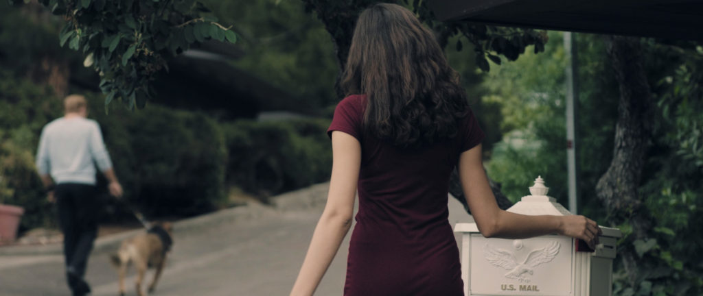
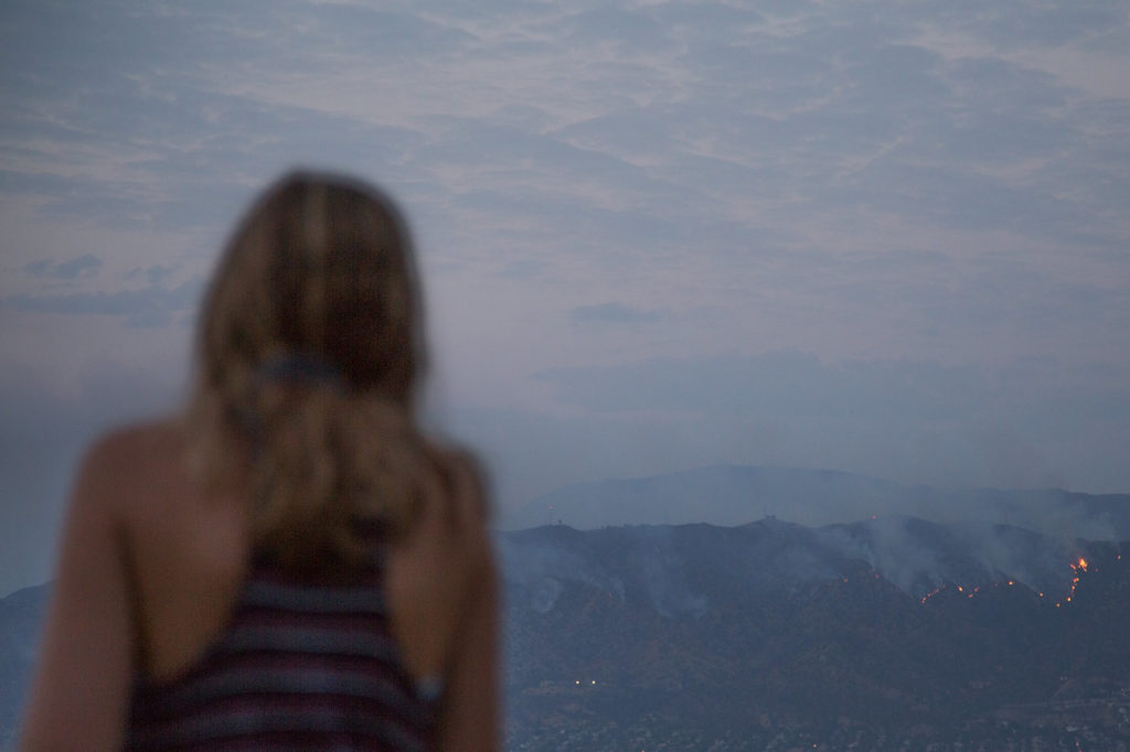
Over the past few weeks I’ve been working tirelessly on the finishing work for my feature film Shadows On The Road. I’ll have some big news about the film’s release very soon (and the full trailer!), but for now I want to take a moment to share my finishing workflow, which was quite unique.

For those of you that aren’t as familiar with the terminology, finishing is essentially everything that happens after the picture edit is locked. It includes color correction, stabilization, noise reduction, and audio mixing amongst other things.

Below I’m going to break down each of the finishing stages that the film went through, and why I chose to take an unconventional path in some respects.

If you’re interested in hearing about my offline editing workflow and why I decided to lock picture reel by reel, be sure to check out this article here.

RESOLVE TO FCP X, AND BACK TO RESOLVE

While I initially intended to edit the feature in DaVinci Resolve, for a number of reasons I decided to cut it in FCP X. I love Resolve and certainly could have cut this entire film on the software (in fact, I even started cutting the first few scenes in Resolve), but ultimately realized I could work faster on FCP X. I hadn’t yet edited any other long form projects on Resolve, and at the time I didn’t have the same shorthand that I did with FCP X.

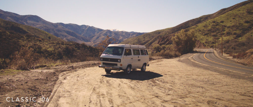
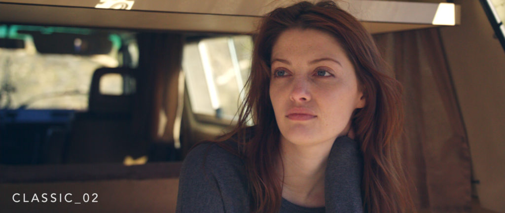
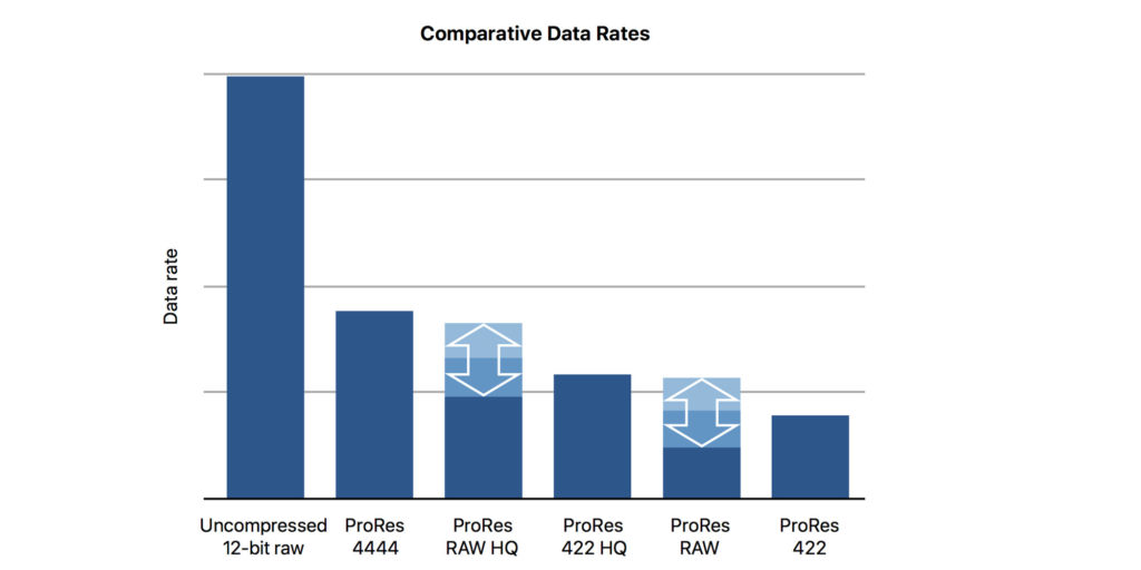
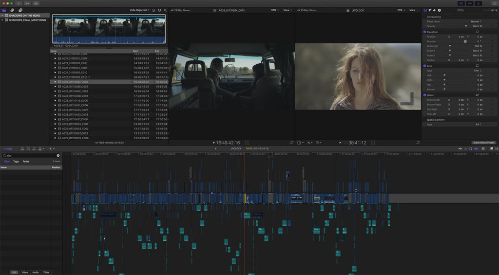
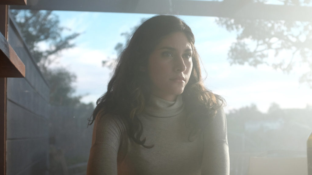
The film was shot entirely in RAW on the Blackmagic URSA Mini 4.6K, so I decided I would ingest the RAW files into Resolve, convert them to ProRes for editing in FCP X, and re-link the FCP X edit to the RAW files in Resolve later on, during the color correction phase. The plan was quite typical workflow-wise, with one important distinction…

I converted the RAW files to ProRes 4444, not LT or Proxy as most workflows would call for. Hard drive space wasn’t an issue for me (nor was performance), and I wanted to have the full 4444 clips living  in FCP X in case I wanted to experiment with any color grading ideas during the picture edit.

I also wanted to hedge against any potential workflow issues that could have come up when round tripping back to DaVinci Resolve. I knew I’d likely be using a lot of compound clips, some speed adjustments, transitions, etc. in FCP X, and in case any of that didn’t translate properly to Resolve, I wanted to know I could output a full 4K ProRes 4444 data master straight out of FCP X that could later be brought into Resolve to be colored. This would never be my plan A, but it was a backup option in the event that I needed to turn around a quick deliverable, but was faced with potential translation issues when relinking to the RAW.

When the picture was eventually locked and ingested into Resolve via FCP XML, there were no issues reconnecting to the source material, so in the end it was a non-issue. I simply imported the XML, pointed it to the RAW files in the session, and I was ready to start coloring.

That said, I didn’t start coloring just yet, as I wanted to get through post-audio first…

POST-AUDIO

At the outset of this project I had no plans to edit dialogue, do sound design, or mix the project myself… But that’s exactly what happened in the end. When the picture was first locked, I had been working with a sound editor who was working some magic in Pro Tools, and things were coming along slowly but surely.

Once festival deadlines started approaching though, we realized it would be faster for me to complete the first audio pass inside of FCP X myself, as I already had laid a lot of the groundwork while editing. Not to mention, I knew exactly what I wanted, so to avoid any unnecessary back and forth (when we had virtually no time to spare), the best option was for me to do a quick pass myself. At least for this version.

Within a week or so, I was able to clean up the dialogue in FCP X, do some minor EQ work, drop in in the background textures, and even do a little bit of sound design. It was far from perfect, but certainly good enough for a basic stereo mix that would be submitted to festivals.

While I intended to eventually move the project back to Pro Tools, at a certain point I decided it would be best to keep the audio work contained entirely within FCP X. After revisiting the festival cut, I was feeling confident I could get the audio where it needed to be myself. Had we re-opened the ProTools session at this point, a lot of the work I did would have been lost (much of which was sounding great), and it seemed to silly to virtually start from scratch when my pass was already most of the way there. Especially because the audio requirements on this film were quite simple, and the source material was recorded really well.

As for the audio workflow, I followed a standard protocol – starting with dialogue before moving on to music, backgrounds, and effects.

The dialogue was a challenge in some respects, as many of the scenes were shot in noisy environments – loud streets, at the beach, windy farms, etc. – which of course all created issues when editing.

This meant that I needed to do a lot of trickery in post, including swapping audio from different takes, using wild lines, and carefully mixing in background textures, room tone, or sound design elements to mask any flaws. I tried to do as much dialogue editing as possible on it’s own (in isolation of music/effects), but at a certain point I actually worked on all three together, specifically in scenes where there were problem areas. This is definitely not standard practice, but it was what the film called for, at least in certain scenes, and it got the job done. In the end, I was very happy with the final mix.

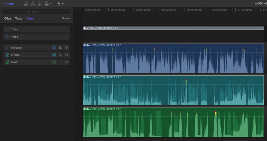
I’m also happy to report that working on audio within FCP X was relatively painless. I simply gave every audio clip a role (dialogue, music, or effects), and organized the timeline into audio lanes. This allowed me to easily toggle things on or off by group, and create compound clips to add master effects to each stem as needed.

When I finished editing all of the audio, I created one giant compound clip of the entire film which allowed me to make global changes to just the dialogue, music or effects. All I added at this point was some minor compression on all the dialogue to even it out, and some levels adjustments for the music.

Once that was done, I went back to my master compound clip (which included the “stems”) and applied a limiter to it. This was needed because there were a few sections of the film where the audio peaked just barely above 0db, so the limiter was used to crush those moments back down.

And with that, my audio work was virtually done. It took 2 – 3 weeks in FCP X (not including my first festival pass) to get it where it needed to be, which is not bad all things considered. It will live as a stereo mix forever (not 5.1) and I’m totally fine with that. There are virtually no moments in the film that really call for a 5.1 mix, and I don’t feel that anything will be lost by mastering in stereo.
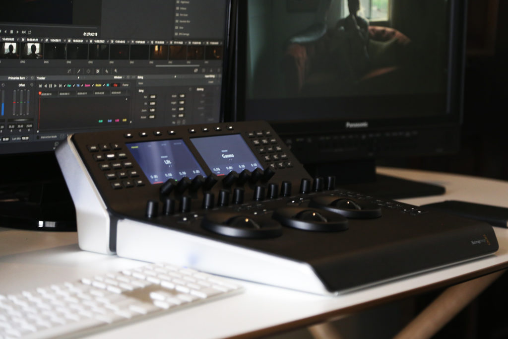
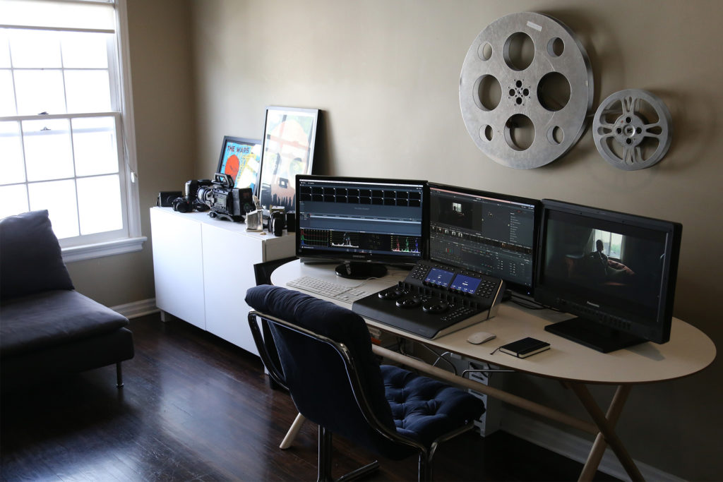
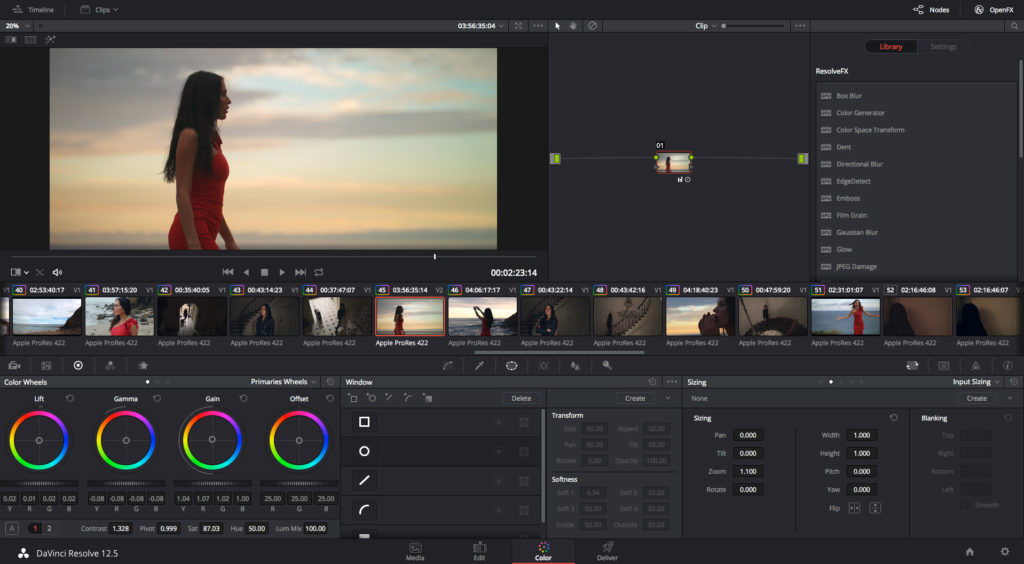
COLOR GRADING

I waited to color the film until the audio was done, as the grade is the easiest and fastest part of finishing for me personally. Once I jumped in, it was relatively smooth sailing –

I started out as always, by following the standard order of operations and matching all my shots first, to prep them for the creative grade. That took a couple of days to complete, but laid the foundation for the more fun and creative work to come.

With everything matched, I did a quick and dirty color pass on the entire feature to get some creative ideas on the table. While I had a concept of what this film should look like visually, I did want to experiment a bit, so I did a full pass working purely off of instinct – coloring shots and scenes as differently as I wanted to, and experimenting as much as possible. I’d say about 50% of this pass actually made it in some form to the final version.

After doing a second full pass to implement some new ideas, I felt like I was getting really close, at least creatively… From there I worked on a few problem shots that needed some extra technical attention – for instance shots that needed power windows or noise reduction, and then was ready to do one more full pass. This time around though, I took a different approach…

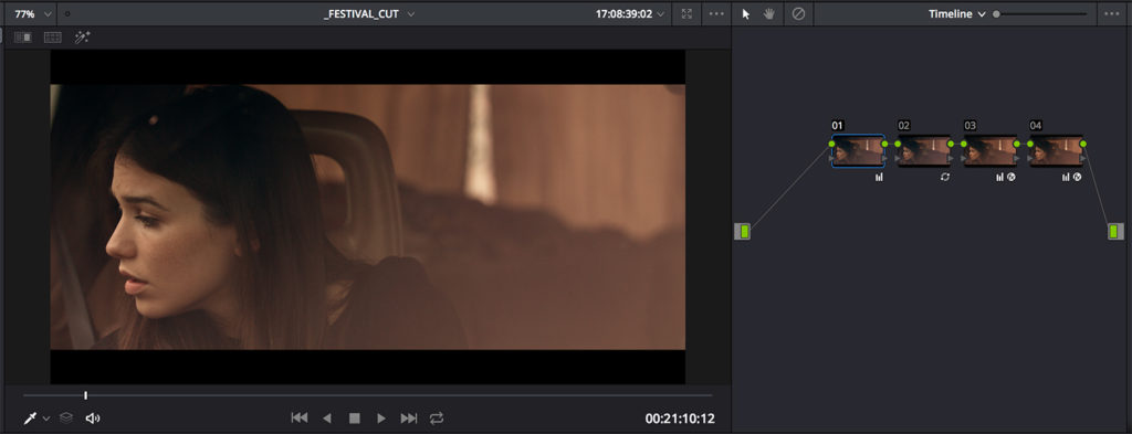
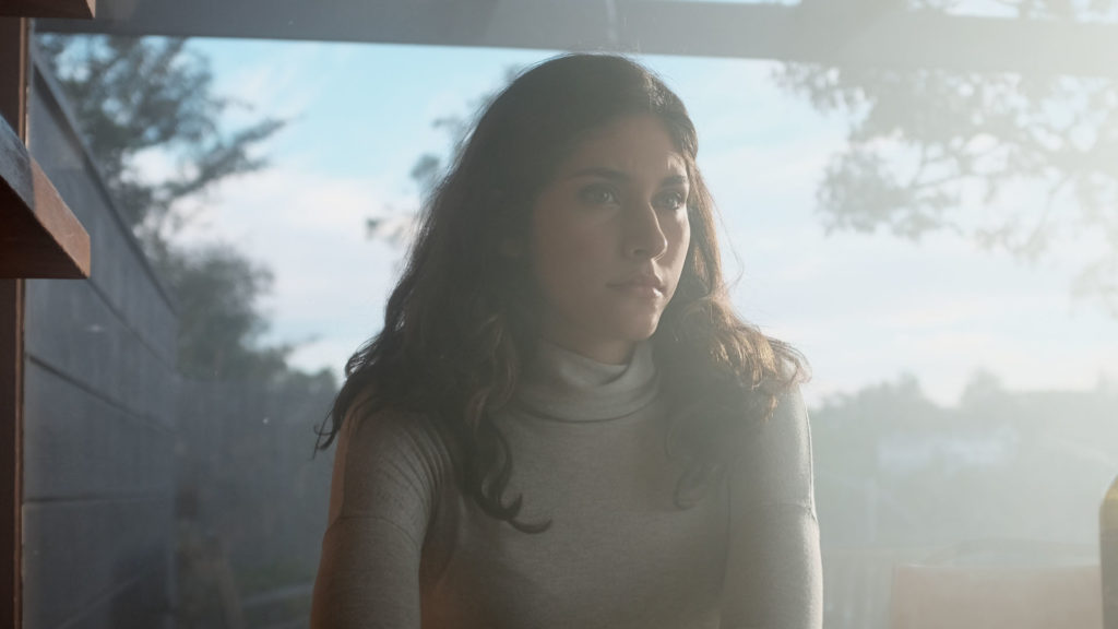
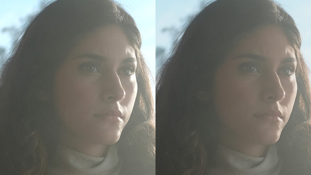
I started by adding a global look to the entire film by using one of my LUTs on a Timeline note. This applies the LUT to everything in the timeline, not just an individual clip.

For hours, I experimented with different LUTs, modifying them, spot checking them across different scenes, until finally I found the perfect combination. It was one of my Summer LUTs with some minor tweaks to make it a little more subtle, as I had already stylized the film to some degree. This gave everything a really nice warm wash, while still allowing each scene to feel distinct. The warmth just helped everything blend together a bit better without overpowering the image.

Then I went through the film shot by shot to see how the LUT was affecting each individual frame. I would say that 80 – 90% of the film worked well as is (with the LUT applied), which made things very easy on me. There were a couple of scenes that needed some additional tweaking to enhance the effect of the LUT, but that was really easy to handle at this point. Within no time the color work was complete.

In total, I probably spent 1 – 2 weeks on and off with color, which is a quick turnaround by my standards! During the color stage I also did some light noise reduction on certain scenes and added a subtle 35mm grain overlay to the entire piece.

THE WORKING MASTER

Normally, when I finish whatever color work I’m doing in DaVinci Resolve, I’ll either output a final master file right then and there, or at least output a picture master that will be combined with the final audio stems in FCP X. In this case, again I did something a bit different…

Being as this was a feature (and not something short form), I thought it would be wise to export what I called a “Working Master”.

I assumed that once a master was rendered out, there would be a handful of shots that would need to be re-exported for one reason or another. For instance, I wasn’t able to smoothly playback shots that had noise reduction on them in Resolve, so I figured some of them might need to be tweaked/re-rendered once I saw them in full motion.

It made sense to export one big master file of the whole film, bring that into FCP X to combine with the final audio mix, and if need be, export any individual shots from Resolve that I wanted to re-color or adjust.

In reality, it actually took about 3 passes before I even got my working master. I was experimenting with different settings for noise reduction and grain, which took several attempts to get right. What ended up looking best, was a very minor temporal noise reduction on the entire film, and then an addition of Super 35mm grain, overlaid at 50% opacity. It seemed to give me the best balance of cleaning up the image while also giving it some character.

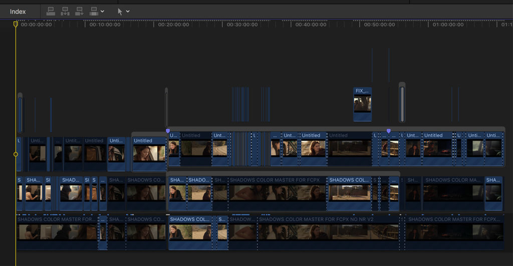
Once I had that working master looking good, I went back into Resolve to adjust a handful of shots that needed some more work. Those shots were exported as a series of patch files, dropped back into my FCP X timeline, and re-assembled.

I took things one step further in FCP X by bringing in one of my earlier attempts at a working master (which had too little noise reduction for most scenes), and using chunks of it for particular sequences that looked better with less NR. There were only a handful of instances like this, and the two files looked pretty similar, but sometimes the second pass just looked a bit better. Wherever that was the case I used it in place of the main working master file.

Something else FCP X was surprisingly great for was stabilization. I’ve used Resolve’s stabilizer many times before and it’s excellent. But on a couple of stabilized shots on this film, I ended up getting better results with FCP X. I’m not sure why this was the case as my settings in Resolve seems to be optimal, but for a handful of shots I actually did the stabilizing in FCP X directly.

Now with all the assets in place – the working master, patch shots, stabilized shots, etc. – I watched it all the way through to catch any final color tweaks. I noticed half a dozen or so extremely minor adjustments that needed to be made across a series of shots, and actually made those changes in FCP X too. The work was so minor and was easier to complete in FCP X as opposed to going back into Resolve just to drop the saturation 2% (for instance).

With that done, so was the film.

The credits were laid in (previously designed in photoshop, so I simply dropped in the cards and timed them), and the file was ready to be exported. I decided to master the film in 2K, as I had done enough stabilization/reframing in post that it made sense to, and I think the final version is really looking beautiful.

FINAL THOUGHTS

I learned a few key things from this process –

First off is the importance of editing a feature in whichever tool you’re fastest in. I love DaVici Resolve and will certainly consider cutting my next feature in it, but was happy to work with FCP X on this one, and quite honestly surprised at how well it handled the project. Especially considering how bloated the project file became over the months.

I also feel somewhat liberated after doing a really solid audio pass right within FCP X. With any editing software right now – especially Resolve with Fairlight integration – great post audio is becoming more accessible than ever. While I will always value the expertise of a dedicated sound pro, I still like to know I can handle it within my own means when I need to. Much like knowing how to composite or color can save you a tremendous amount of money over the course of a career, knowing audio can do the same.

The working master is also a concept I’m going to apply to virtually all my future projects. It seems to make sense both tactically and philosphically. On one hand, it makes the process run more quickly and efficiently as there is less wasted time running unnecessary exports. But it also helped me get to the finish line faster from a mental standpoint. I wasn’t tempted to delay or put off the final export process, or to procrastinate in any way. I knew there was a safety net, and I could still make adjustments if I noticed anything substantial. That made it easier to get to the finish line on the Resolve session, and commit to a final version to be exported.

In the near future, I’m going to be sharing the official trailer for Shadows On The Road, and more news about film so stay tuned for that!

I’ll also be doing a follow up post on my experience editing the trailer, so if you have any questions you’d like me to answer on that note, please leave a comment below.

And for more content like this, follow me on Instagram, Facebook, and Twitter!

Noam Kroll is an award-winning Los Angeles based filmmaker, and the founder of the boutique production house, Creative Rebellion. His work can be seen at international film festivals, on network television, and in various publications across the globe. Follow Noam on social media using the links below for more content like this!

Why “Soft Clip” Is A Key Ingredient For The Cinematic Look + How To Easily Apply It In Post

$
0
0

There are countless variables that come into play when attempting to achieve a filmic look with digital source footage. Lighting, lensing, dynamic range, and color rendition all play a huge role in making our footage look more cinematic (or filmic if you will), and those are the primary areas most of us are focused on. But like many creative tasks, when it comes to the film look – the devil is in the details… And going the extra mile is always mandatory.

Many filmmakers will pair vintage glass with a high dynamic range camera, and use a combination of LUTs and film grain in post to achieve a filmic aesthetic. Depending on how the footage was shot, lit, and which camera was used, these steps in production and post can go a very long way on their own.

Even when following all the usual protocol though, there’s often something about the footage that still feels inherently digital. It can be a challenge to identify or articulate exactly what it is, but it is clearly felt on some level by every viewer.

More often than not, this X-factor can be chalked up to a singular detail in the image that gives it away as digital. And while there could be many potential culprits at play; skin tones, color contrast, or black levels for instance, in my experience 9 times out of 10 the issue involves highlights.

One of the most identifiable characteristics of film is the subtle highlight rolloff that transitions seamlessly from well exposed areas of the frame to hot spots that are blown out/overexposed. Although some digital cinema cameras handle highlights quite well, the vast majority don’t, and even the best digital cameras still can’t perfectly replicate film in this respect. Digital blow-outs look harsh and synthetic as overexposed areas clip directly to white with almost no transition. This is in stark contrast to film which delivers a more pleasing, subtle, blooming effect in the overexposed areas.

The good news is, even digital footage shot on a low dynamic range camera (with lots of clipped highlights) can be remedied in post with a simple curves adjustment. The basic idea is to bring the white levels/highlights down to make any blown out areas appear softer, and more natural.

As an example, take a look at the image below and note the sidelight on the talent’s face. While it’s not fully clipping to white, the highlights do look quite harsh –

To mitigate this, we can add a simple curves adjustment in DaVinci Resolve (or any editing/grading software), that should be somewhere along these lines –

We’ll then add some saturation to the highlights only, by using a Luma vs. Saturation curve. This brings back color information that may have been muted after the highlights were reduced –

And finally, we can push a touch of warmth into the highlights to help them blend in better with the rest of the skin tones, and pull down the shadows a little bit for some added contrast. This is our final image –

The difference is subtle, but stated above – the devil is in the details. Small adjustments like this go a very long way in giving digital footage the extra touch that’s needed to fully realize a filmic look.

For a more clear example of what our adjustments are doing, here is a side by side comparison of the model’s face, before and after –

For those of you that are running DaVinci Resolve, you can also use the “Soft Clip” feature in place of a curves adjustment. It will effectively give you the same results, but is often faster and more intuitive to work with.

You can use the “High Soft” slider to increase or decrease the effect, and the “High” slider to adjust the threshold, allowing you to very specifically dial in the effect. The settings are on the bottom right of the curves panel –

Whichever technique you use – curves or soft clip – be careful not to overdo it. Like any other adjustment, going too far with the effect will be counter productive, especially when dealing with blown out areas on someone’s face or skin. Reducing a bit of the clipped areas is great, but taking it too far will drain the highlights from the skin, and leave the actor with a dull, lifeless appearance.

So for those of you that are as picky as I am when it comes to highlights, give this technique a try and let me know what you think! Be sure to leave a comment below once you’ve tried it out…

And for more content like this, follow me on Instagram, Facebook, and Twitter!

Noam Kroll is an award-winning Los Angeles based filmmaker, and the founder of the boutique production house, Creative Rebellion. His work can be seen at international film festivals, on network television, and in various publications across the globe. Follow Noam on social media using the links below for more content like this!

My Color Grading Masterclass Is Officially Available For Pre-Order! Get It While It’s Hot!

$
0
0

I’m excited to announce that as of today I will be taking pre-orders for my Color Grading Masterclass, which will be released next month! I created this course as a direct response to countless requests from my readers, who have been clamoring for a comprehensive guide for achieving cinematic looks in post-production.

This 6 hour masterclass is unlike any other color grading course online. While many existing classes simply focus on teaching the functionality of specific color grading applications (such as DaVinci Resolve), this course is primarily creative in nature. The goal is to share my go-to methods for creating cinematic looks with all of you, in a way that is highly accessible – regardless of your skill level as a colorist or what software you prefer to work with.

My personal approach to color grading has always been to keep it simple. Many of the best looks I’ve ever created were the result of simple, purposeful color adjustments that were developed quickly and easily. I’ve always believed that overcomplicating the color process can result in unnecessary work for the colorist, and a final product that can look “over-cooked”, or obviously colored. This ideology was the inspiration behind my Masterclass.

By the end of the course, each viewer will be armed with the skills needed to create unlimited, fully customized creative looks that will take their project’s aesthetic to the next level. And in record time.

Most of the tutorials are demonstrated in DaVinci Resolve, but this course is all about harnessing the tools, techniques, and methods that will deliver stunning color results, no matter what your software of choice. For that reason, everything demonstrated in the course can be applied equally in FCP X, DaVinci Resolve, Premiere Pro, or any other editing/color grading platform for that matter!

The masterclass even includes a module that showcases each major color tool in several editing platforms, so those of you working on multiple applications understand how to apply these creative methods to your work no matter which platform you’re using.

The course includes 12 lessons, each approximately 30 minutes in length, totaling 6 hours of material. The lessons are divided as follows:

SET UP & PREP

  1. Critical Tools– The most essential color grading tools, their primary functions, and where to find them in DaVinci Resolve, FCP X, and Premiere Pro.
  2. Order of operations– A bulletproof workflow for RAW and compressed formats, designed to optimize footage for maximum creative potential.
  3. Shot matching & base grades– The first critical steps of any creative grade.

COLOR FIXES

  1. Exposure Adjustments– Techniques for handling over/underexposed footage to deliver optimal luminance levels with minimal noise.
  2. Balancing Colors– Best practices for executing the primary grade, geared toward a natural/organic starting point.
  3. Perfecting Skin Tones– Assessing and fixing common technical issues that affect skin tones for a more flattering look.

POPULAR CREATIVE LOOKS

  1. Timeless Film Looks– A step by step tutorial, showcasing proper execution for several popular looks associated with classic motion picture film.
  2. The Big Budget Look – From sci-fi to action and everything in between, this lesson teaches core grading skills for several popular big screen looks.
  3. Ultra Stylized– Creative techniques for grading music videos, commercials, art films, and other projects that call for a more aggressive palette.

POLISHING

  1. Black/White Levels– Finding the right shadow/highlight balance, and achieving consistent luminance throughout long form projects.
  2. Grain & Film Emulation– Best practices for applying film grain and emulation in post, giving digital footage a more analog look.
  3. Color Uniformity– The final phase, exploring how global settings, LUTs, and other tools should be used in unison to create a cohesive aesthetic.

By the end of the course, you will be armed with the skills needed to achieve incredible color results in less time than ever. It will help you realize your vision, over-deliver for your clients, and maximize your time by having a clear path to the finish line.

Along with the videos, each of you will also receive 3 custom Cinematic LUTs (color filters) that are yours to keep as well. These LUTs will be used as part of demonstrations in lessons, but are also designed for real world use so you can start applying them to your projects right away.

The course will be officially launched on June 30th, but for the first 100 filmmakers that sign up early I am offering a 35% discount!

Pricing for the course will be $197 at launch, but only $128 with the discount!

I have had loads of e-mails and social media requests for this course, so I anticipate the first 100 will sell very quickly. If you are interested in the course – I recommend ordering right away.

I am also offering a Professional Edition of the Masterclass, that bundles all 3 of my Cinematic LUT Master Packs with the video lessons. These 3 Master Packs contain 108 LUTs, and normally run $267. If you bundle all 3 with your pre-order, I am going to knock another $67 off the price.

Below are the two packages available (course only, and course + LUT package):


I can’t wait to share this course will all of you next month, and seeing the incredible work you do with it!


Noam Kroll is an award-winning Los Angeles based filmmaker, and the founder of the boutique production house, Creative Rebellion. His work can be seen at international film festivals, on network television, and in various publications across the globe. Follow Noam on social media using the links below for more content like this!
Viewing all 138 articles
Browse latest View live